

VISANTE
Project Overview
Visante’s visual identity had become inconsistent as the company evolved. I developed a cohesive brand system that aligned the agency’s positioning with its growth, beginning with competitor research, followed by brand strategy, identity development, and implementation across every customer-facing asset. The refreshed identity strengthened brand recognition while modernizing key visual elements, including a complete redesign of their website.
Sole & Lead Designer
Role
Brand System & Website
Project Type
9 Months
Timeline
The Client Challenge
With increasing competition in the healthcare industry, Visante needed a stronger, more cohesive brand presence. The existing identity had become inconsistent across departments and marketing materials, resulting in a diluted brand experience. The goal was to create a unified system that aligned Visante’s positioning, reinforced its expertise, and differentiated it within a competitive landscape.
The Creative Strategy
Using a research-driven design process, I transformed Visante’s fragmented visual identity into a cohesive brand system built for scale. The final system modernized the brand while maintaining recognizable elements that preserved existing brand equity, updating the color palette and graphic style but keeping the core palette and typography the same.
Brand Audit
To establish a clear direction for the rebrand, I analyzed key competitors to understand industry standards, identify whitespace opportunities, and evaluate Visante’s market positioning. Alongside the competitive review, I assessed the existing visual identity to pinpoint inconsistencies and opportunities for improvement. The audit revealed the following key opportunities:
Mood Boarding
Following the discovery phase, the team aligned on a vision for a brand that felt modern, confident, and bold. To help stakeholders evaluate the range of possibilities, I developed three distinct creative directions, each representing a different level of transformation—from a refined evolution of the existing identity, to a strategic refresh, and finally a complete rebrand. After reviewing each concept, the team selected the strategic refresh, which included the following:
Brand Guidelines & Logo
To create a strong foundation for the brand, I developed a comprehensive set of brand guidelines that defined how the visual identity would be applied consistently across every touchpoint. I also created an alternative logo to be used when the full logo was not necessary. The system established standards for color, typography, photography, iconography, illustration, and supporting graphic elements, and logo guidance. By documenting these principles early, the guidelines ensured consistency and scalability.
Website Redesign
With a dedicated full-stack developer and UI/UX designer on the project, the workflow emphasized close collaboration from concept through implementation. I established the website’s visual direction in Adobe Illustrator, allowing the interface to be developed alongside the broader brand system rather than as an isolated digital product. After the layouts and design language were approved, the project transitioned into Adobe XD for prototyping, refinement, and development handoff. This approach ensured consistency across digital and physical applications while supporting an efficient, collaborative production process. The following outlines each phase of the workflow:
After development was completed, the team completed a thorough QA for both pre-launch and post-launch.
Brand Assets Updates
With the website live, the next phase focused on extending the identity system across the organization’s remaining materials. Using the newly established brand standards and website as the foundation, I updated and unified a wide range of digital and print assets to create a cohesive experience across every audience interaction.
Project Mockups
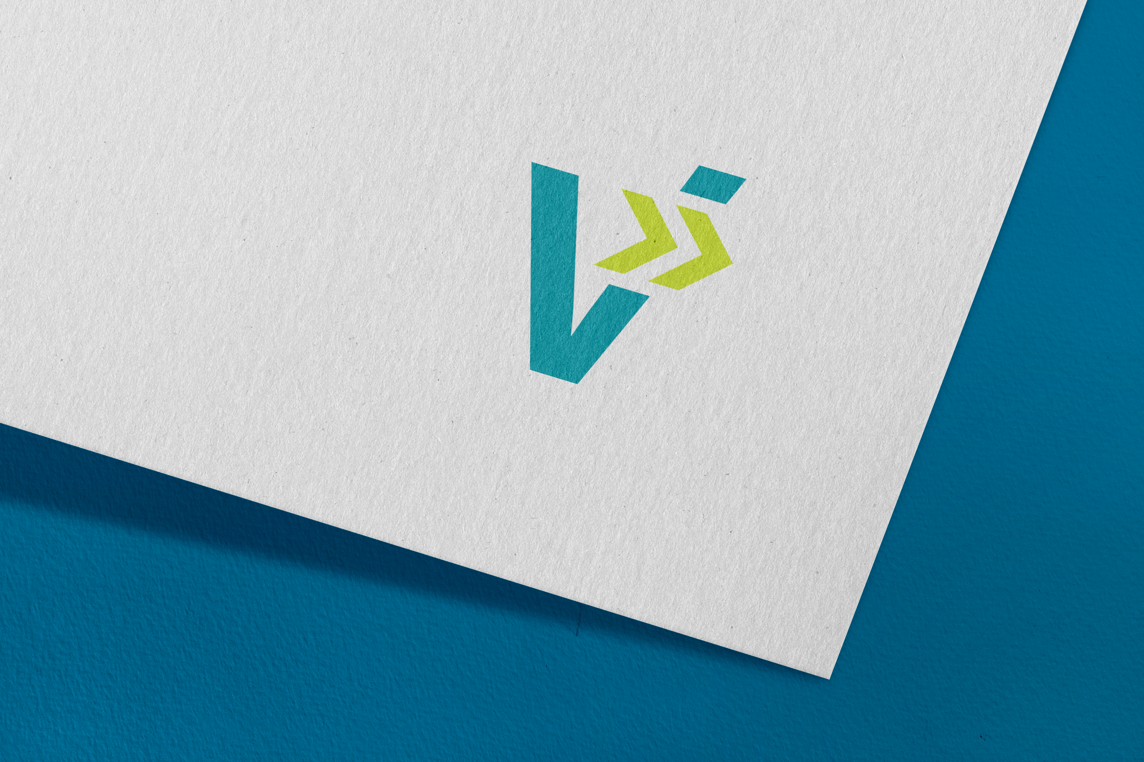
Alternate Logo Design
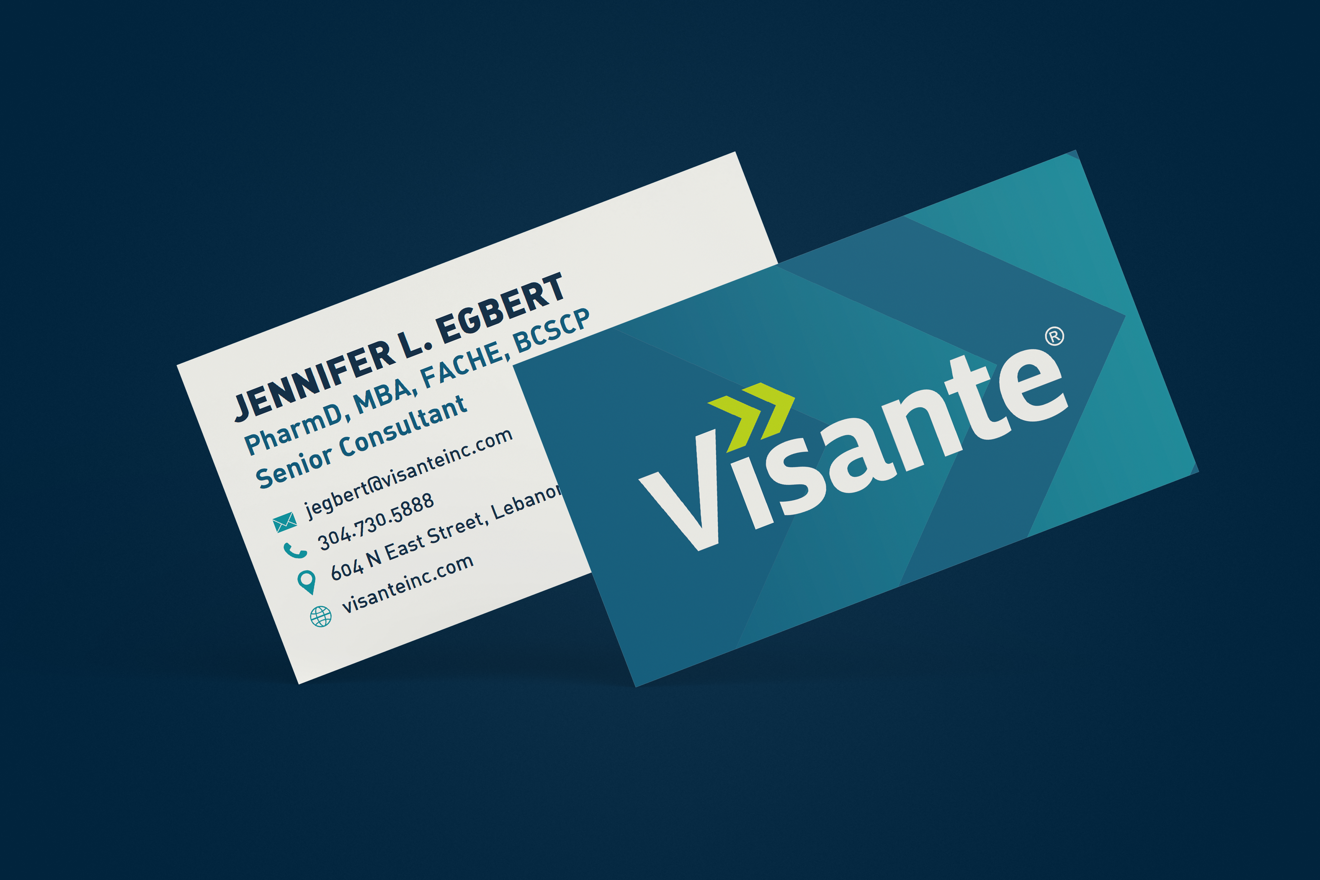
Business Cards
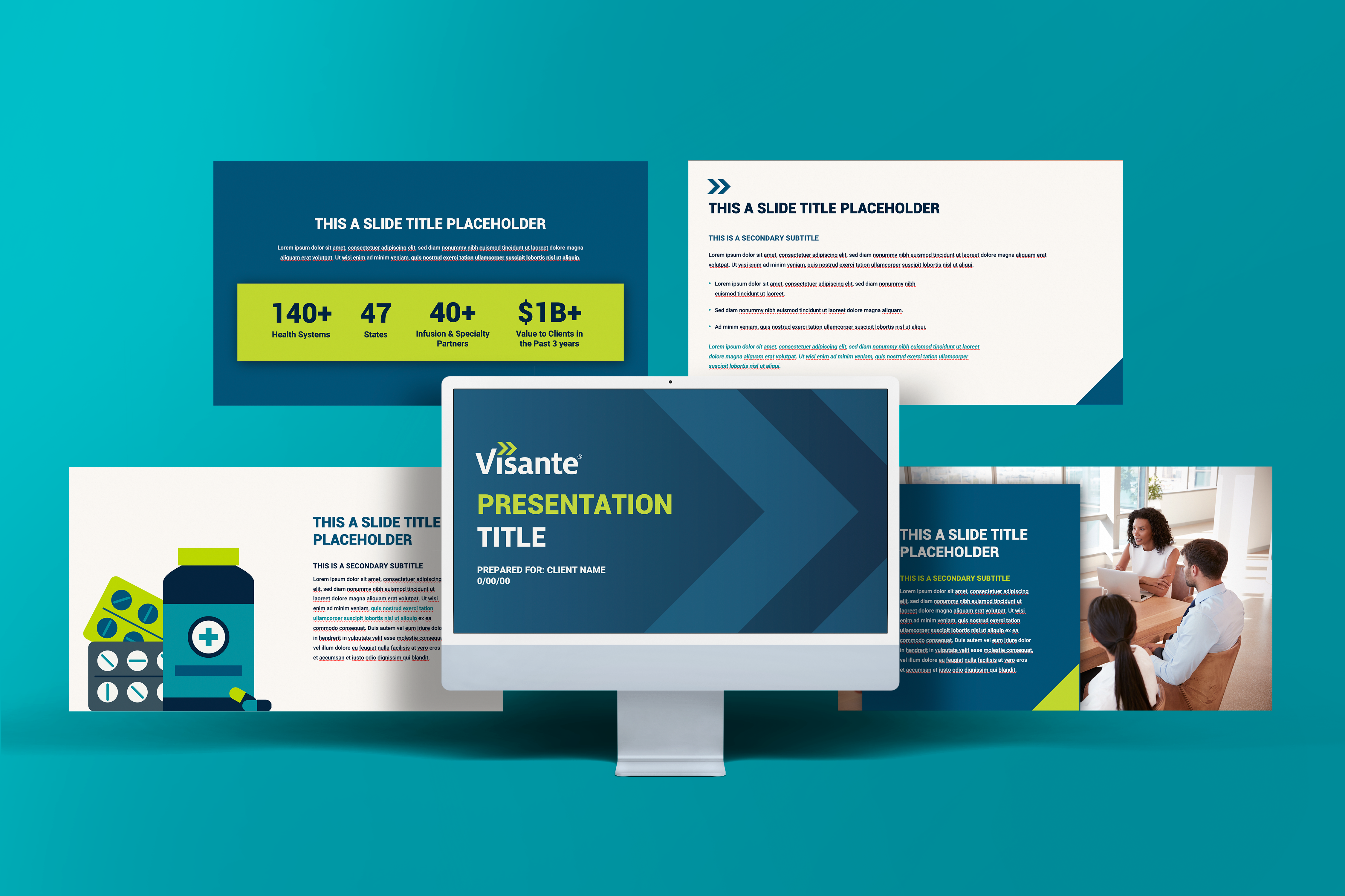
Master Presentation Deck
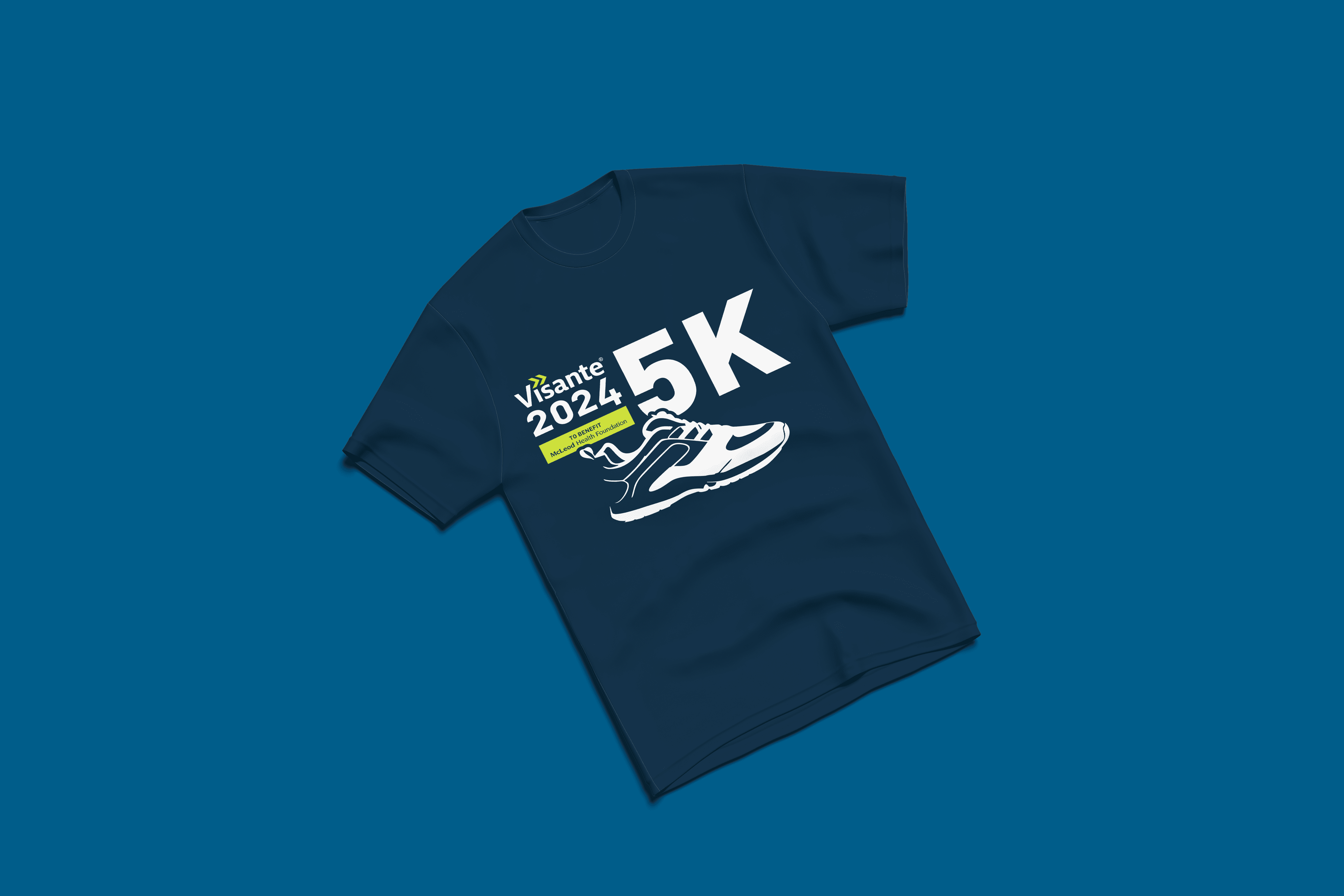
Event Tshirt
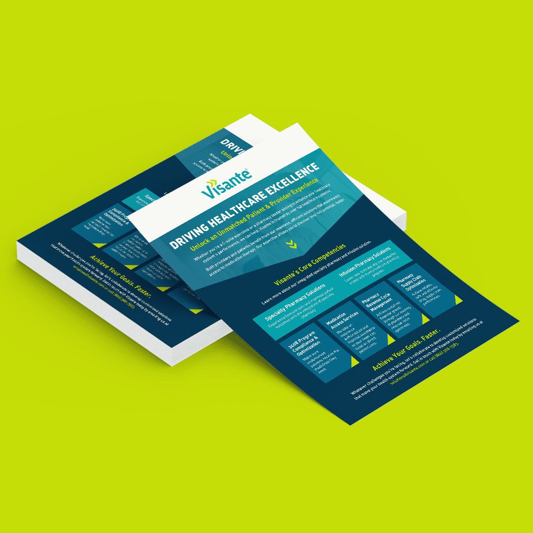
Sales Sheet
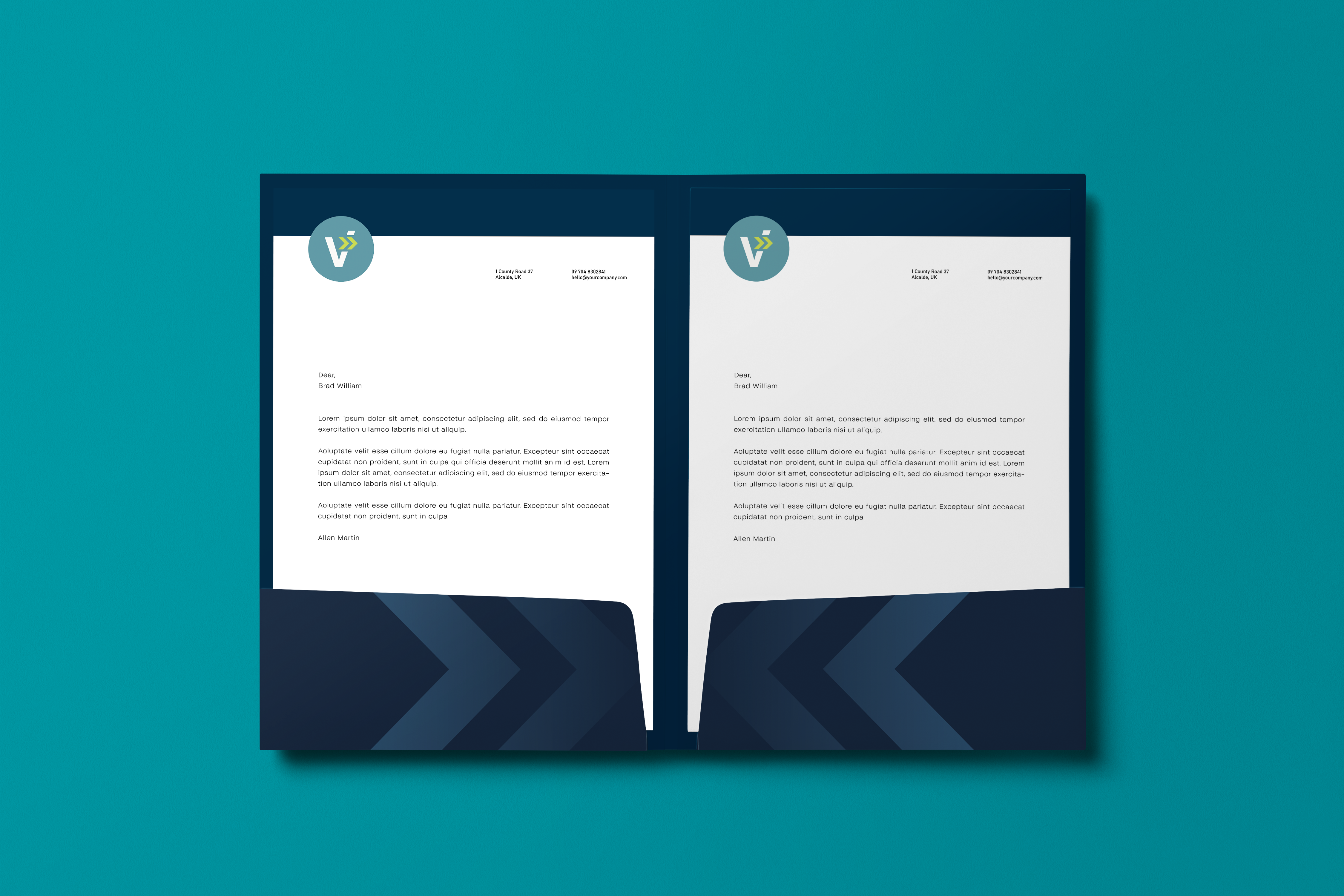
Pocket Folder

Poster

Brochure
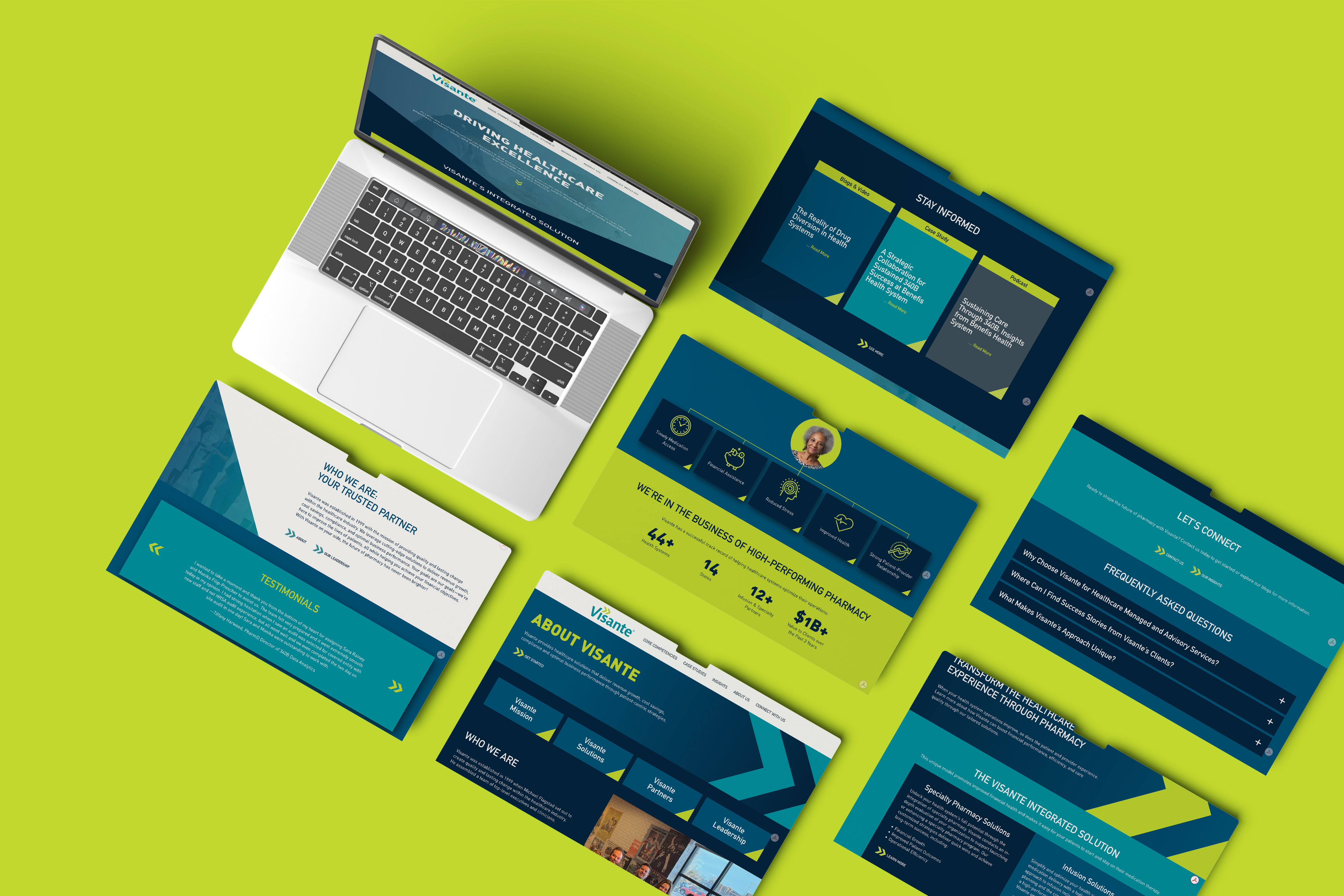
Website Redesign
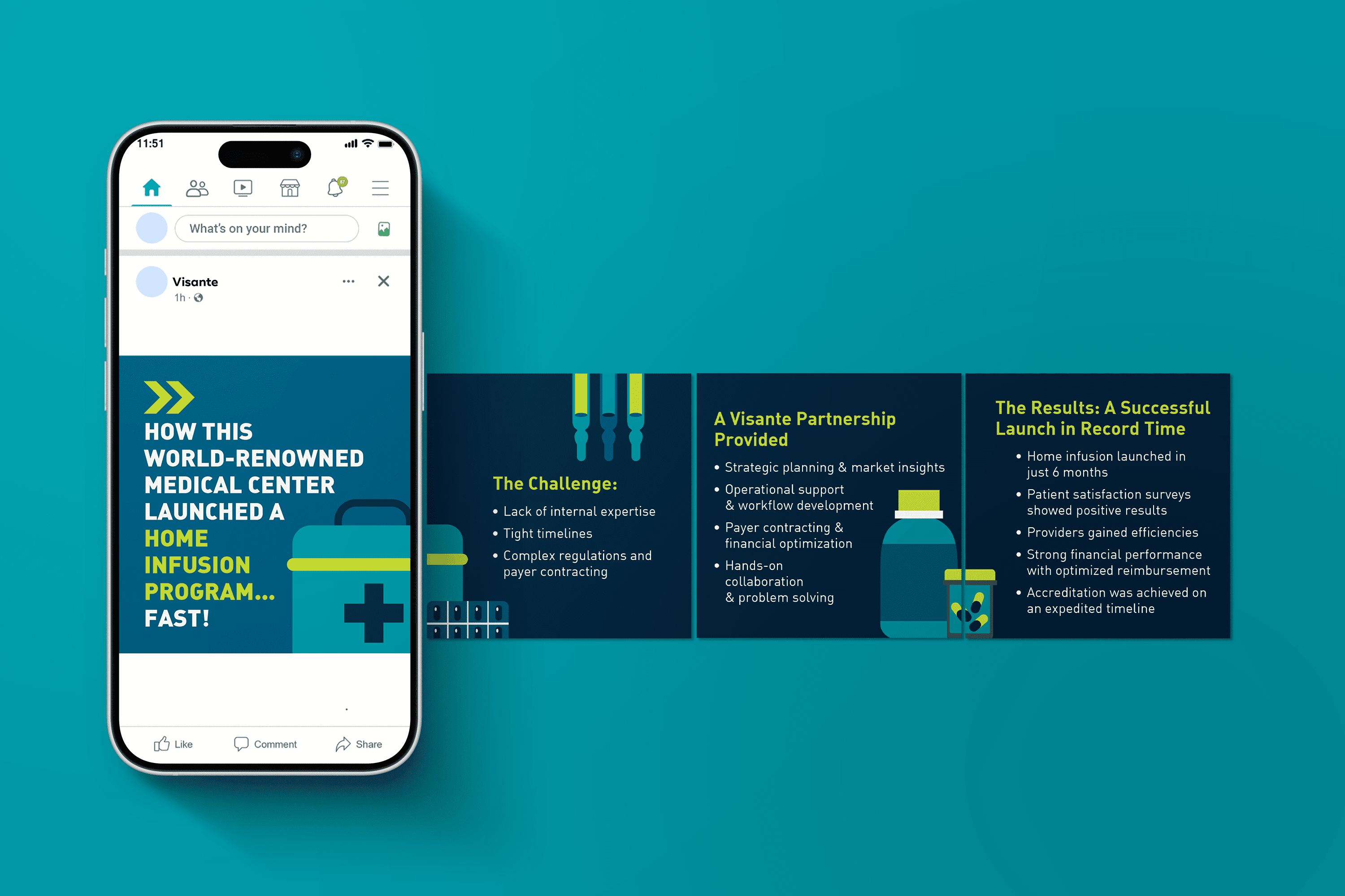
LinkedIn Carousel
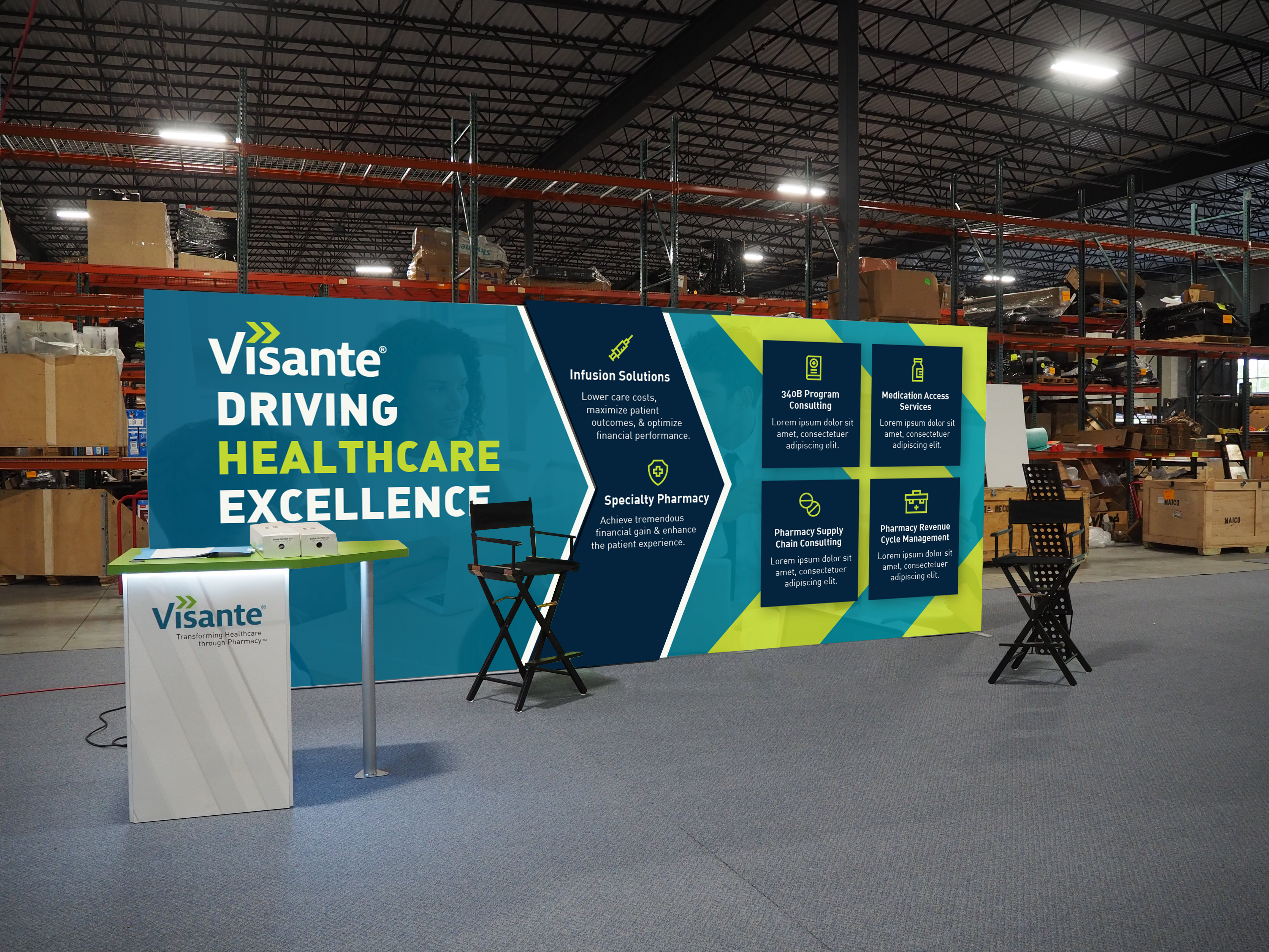
Trade Show Exhibit

Podcast Logo

Sales Sheet
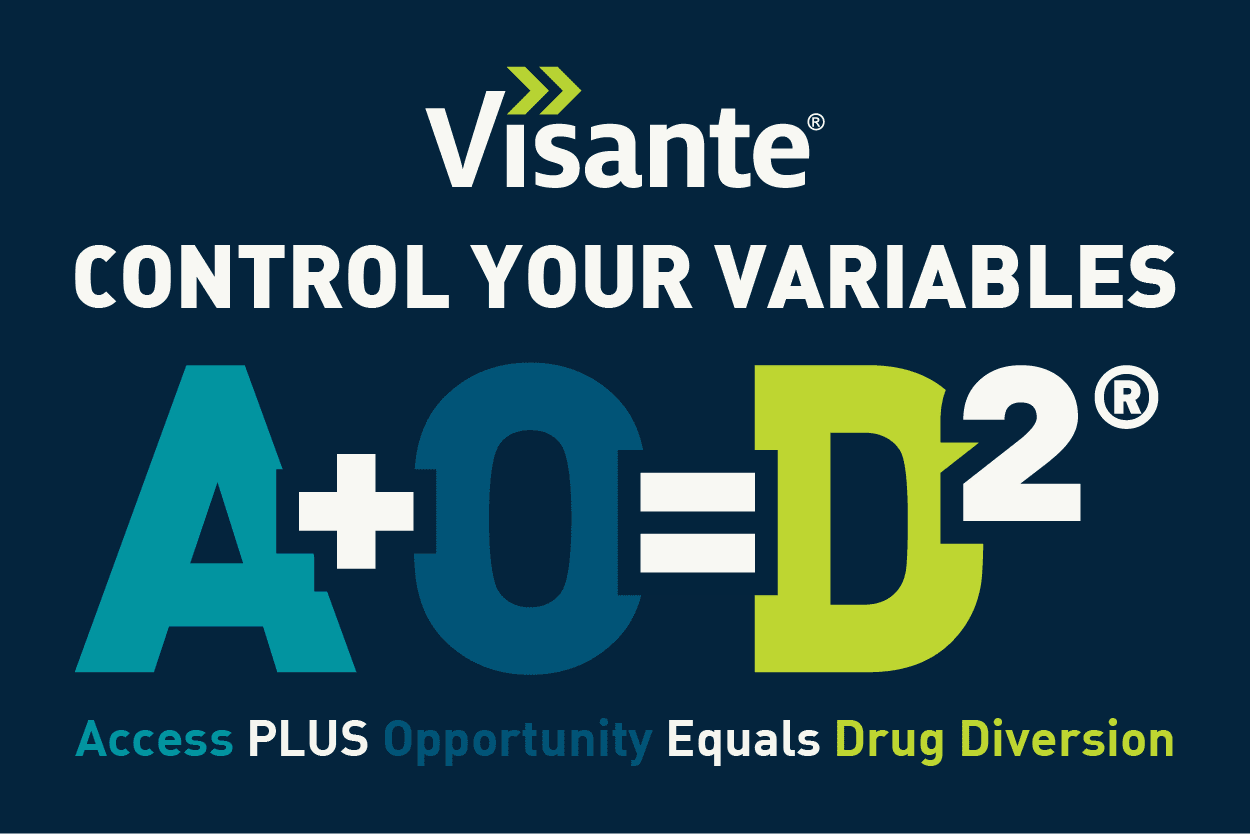
AOD Graphic
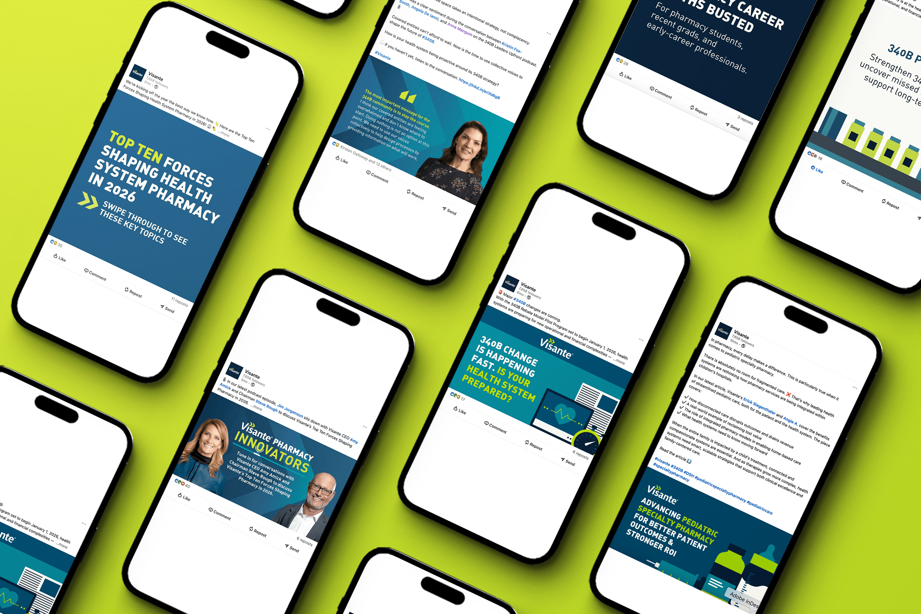
LinkedIn Posts
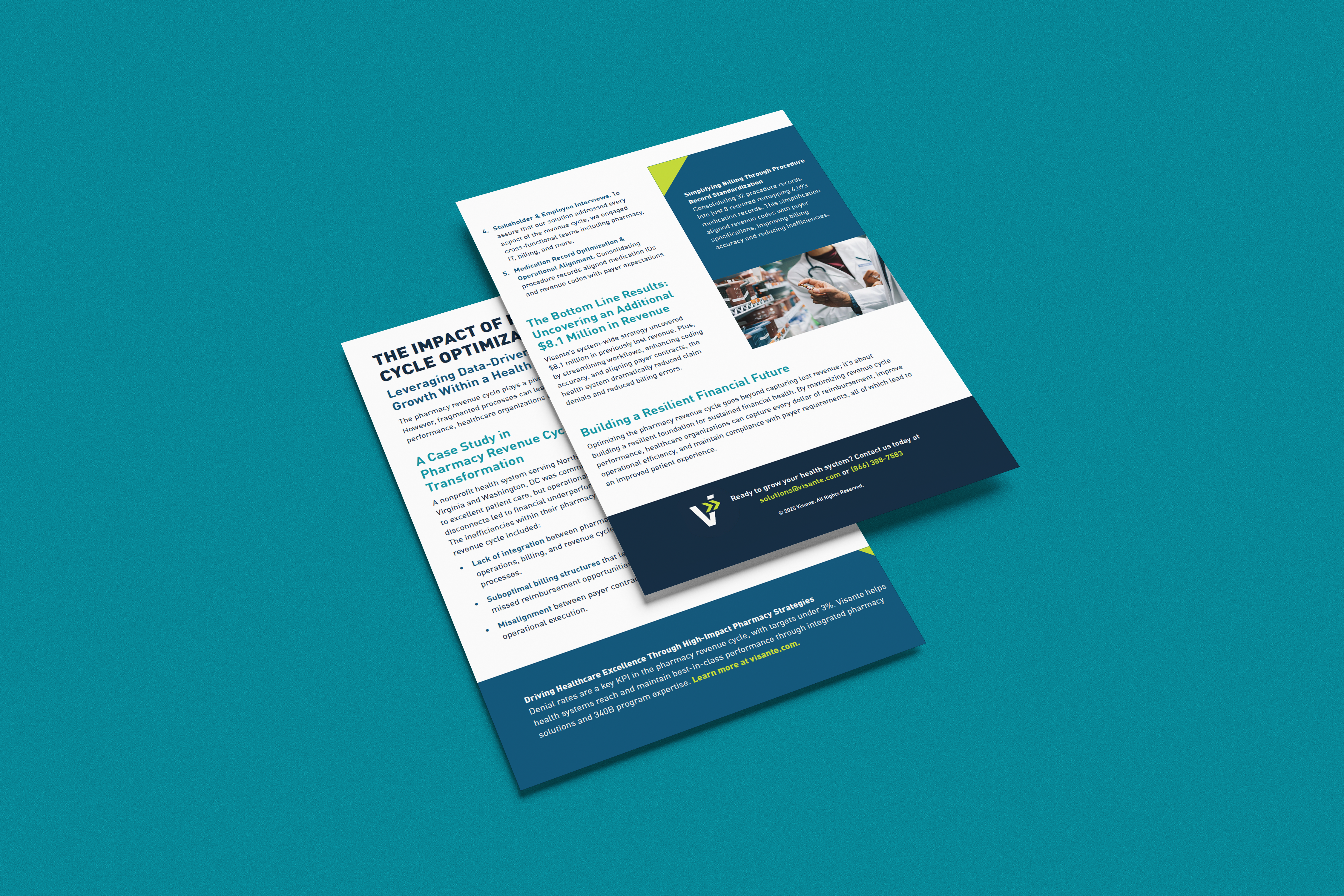
Sales Sheet
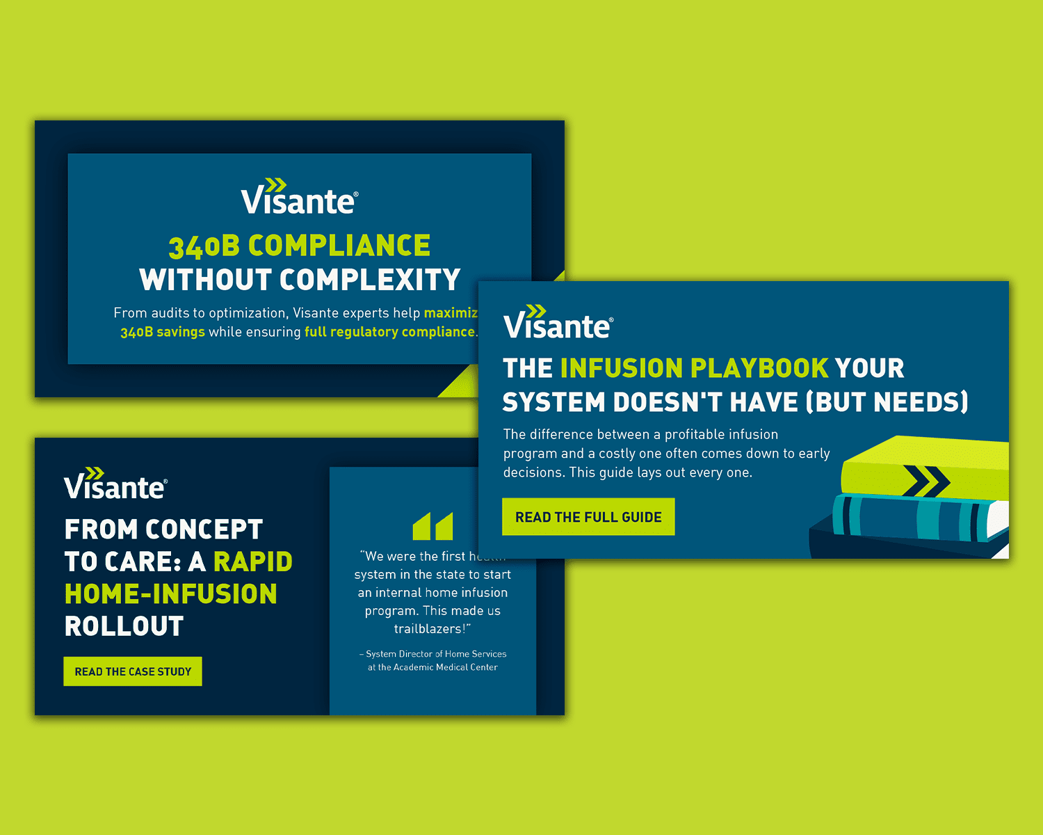
LinkedIn Ads
Please note that while all designs shown were created by me, this project was completed in association with and credited to Gemini Agency.