

Project Consulting Group
Project Overview
Originally established in 1998, the brand had seen little visual evolution, resulting in an identity that no longer reflected the company’s capabilities or industry standards. The redesign refreshed the brand with a modern, cohesive visual system while maintaining its established equity.
Sole & Lead Designer
Role
Brand System & Website
Project Type
6 Months
Timeline
The Client Challenge
One of the primary challenges was the logo’s inability to adapt across different backgrounds, particularly in partnership settings where a versatile white version was essential. While preserving the recognizable red ball icon and established red and blue color palette was a priority, the objective was to modernize and refine the overall identity into a more cohesive, adaptable brand system that better reflected the company’s evolution.
The Creative Strategy
Rather than reinventing the brand, I focused on identifying the elements that had built recognition over the past two decades and distinguishing them from the aspects that no longer served the company. This strategic approach allowed me to preserve the brand’s strongest visual equity while modernizing the identity with a more flexible logo system, refined visual language, and improved usability across digital, print, and partnership applications. The client was also using a single-page website, which I redesigned to be a multi-page site to improve visibility in search.
Stakeholder Discovery
Because this client came to me with pain points already identified, we moved right into discovery without the need for an audit. The discussion revolved around the client’s goals not only for this project but for the business and prompted the following questions:
Mood Boarding
After the discovery phase, the team established a shared direction for a brand that felt more modern, confident, and bold. To support decision-making, I explored three distinct creative directions ranging from a light refinement of the existing identity to a more strategic update, and finally a full rebrand. Following review of each concept, the team aligned on the strategic refresh approach, which included the following:
Brand Guidelines & Logo
From there, I translated the selected strategic direction into a comprehensive brand system designed to ensure consistency and scalability across all applications. This included defining clear guidelines for how the identity should function in practice and establishing standards for logos, color, typography, and photography. By systematizing these decisions early, the guidelines provided a clear framework for consistent execution across every touch point.
Website Redesign
This project was executed in close collaboration with a full-stack developer and UI/UX designer, allowing the website to evolve in parallel with the broader brand refresh. I established the initial visual direction in Adobe Illustrator to ensure the digital experience felt like a direct extension of the new identity system rather than a separate exercise. After the layouts and design language were aligned, the project transitioned into Adobe XD for prototyping, refinement, and developer handoff. This approach supported consistency across digital and physical applications while maintaining an efficient, iterative workflow. The following outlines each phase of the process:
Brand Assets Updates
With the website live, the next phase focused on extending the identity system across the organization’s remaining materials. Using the newly established brand standards and website as the foundation, I updated and unified a wide range of digital and print assets to create a cohesive experience across every audience interaction.
Logo Before & After

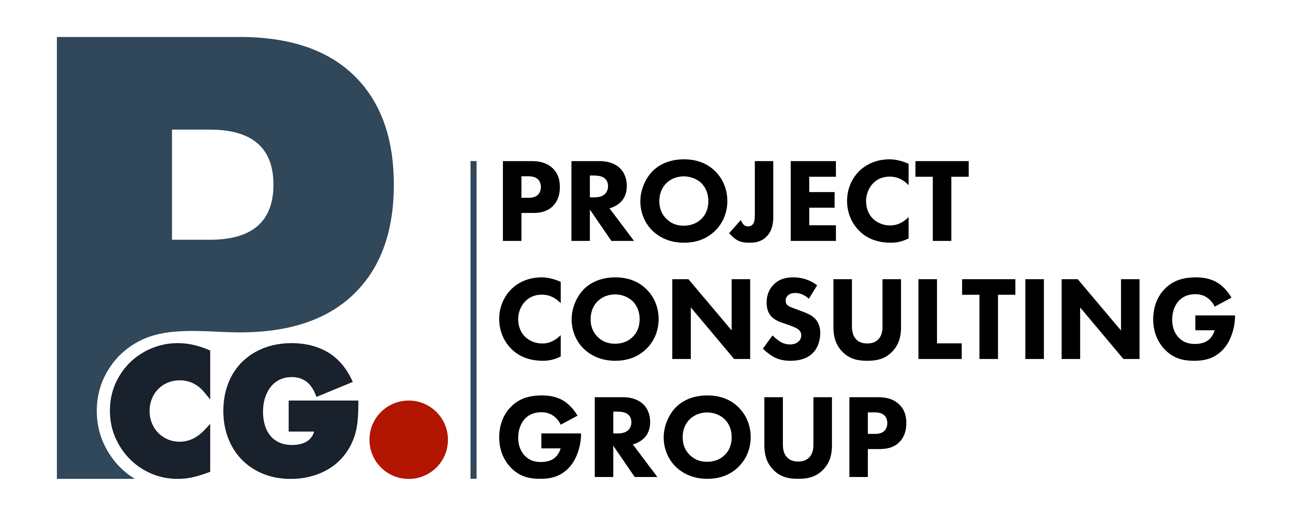
Project Mockups
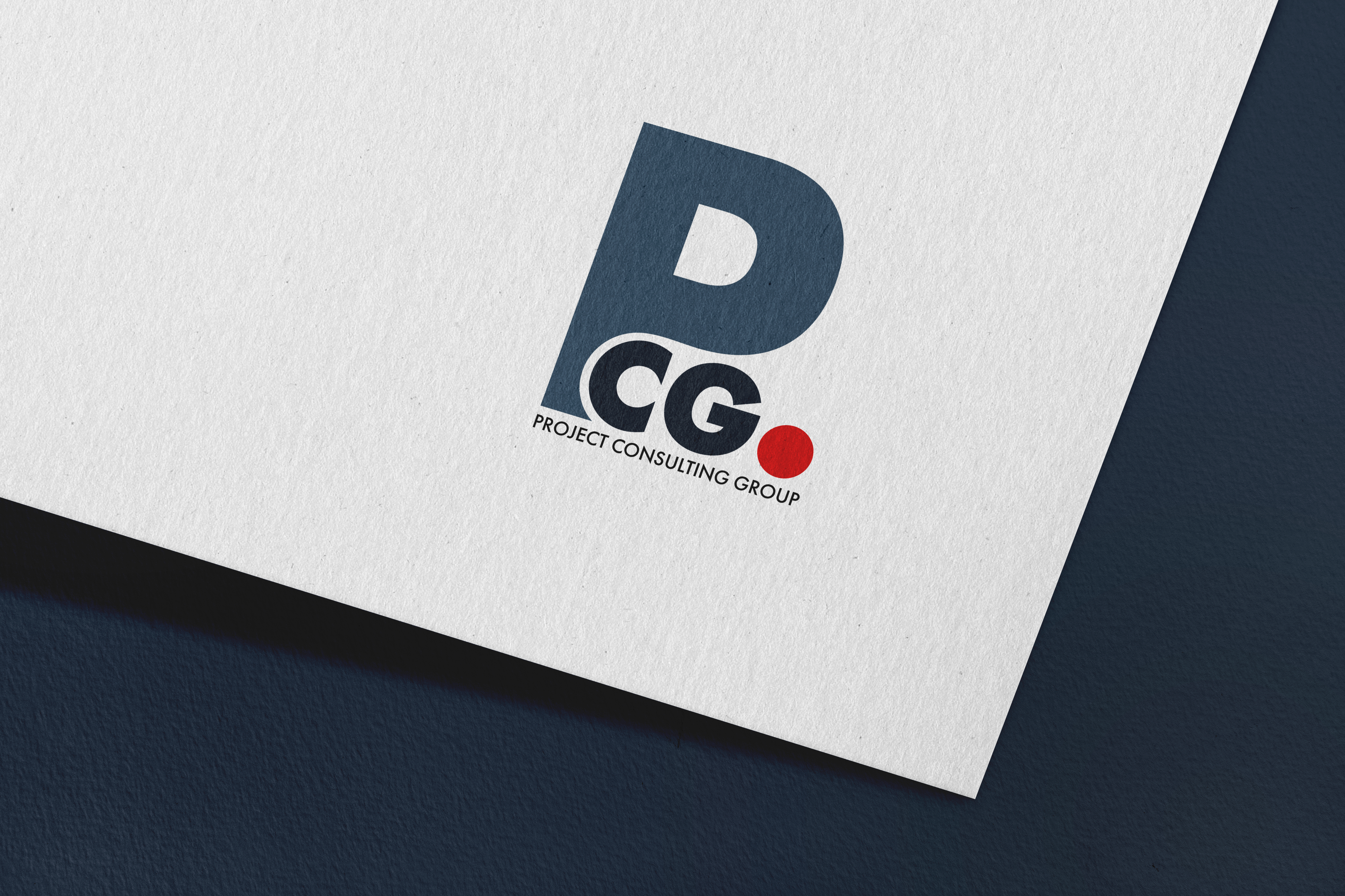
Logo Design
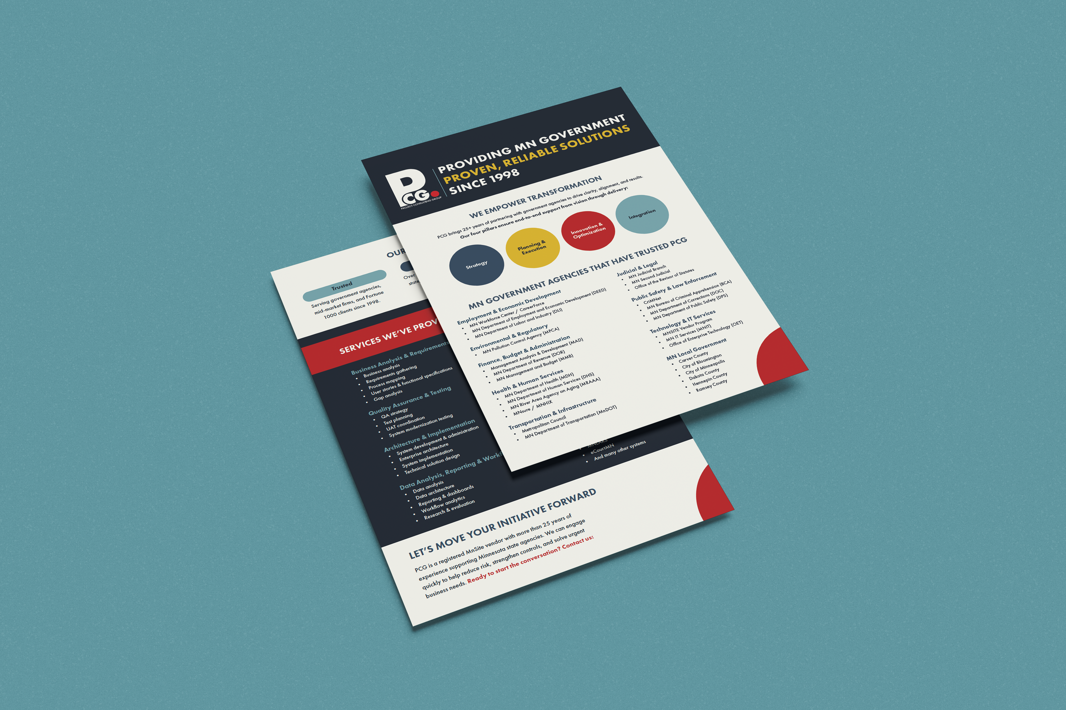
Sales Sheet
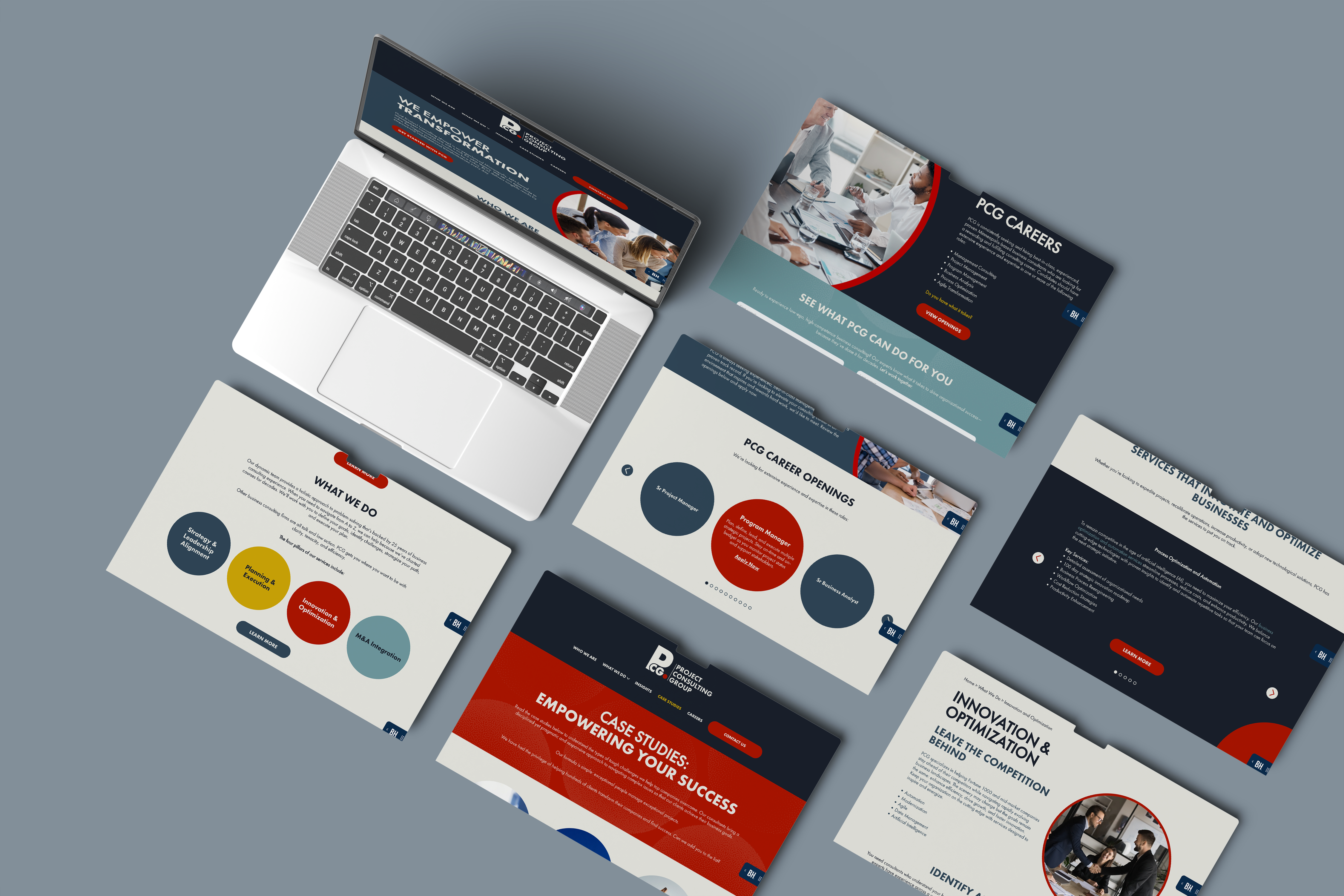
Website Design

Business Cards
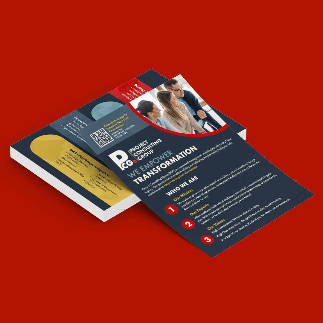
Sales Sheet
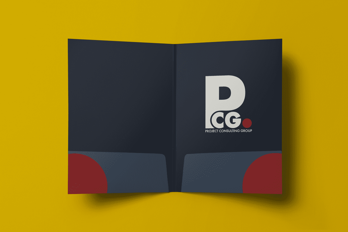
Pocket Folder
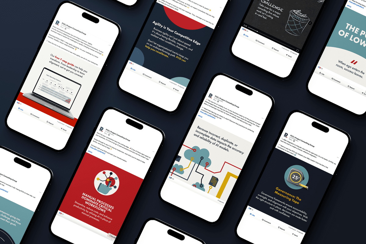
LinkedIn Posts
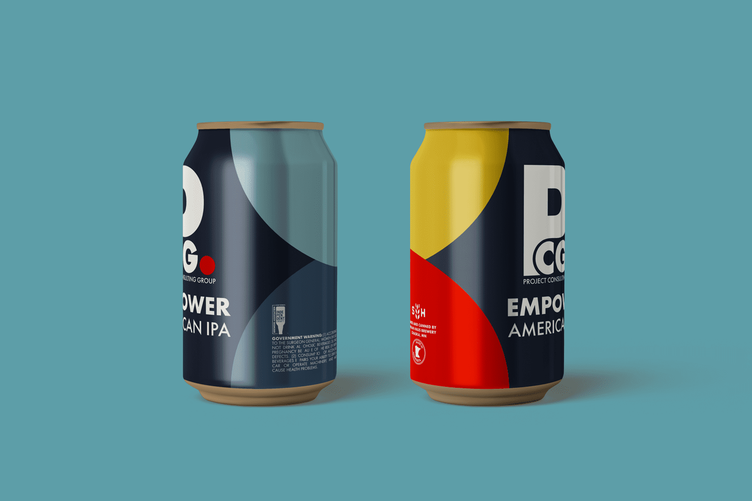
Beer Can Labels
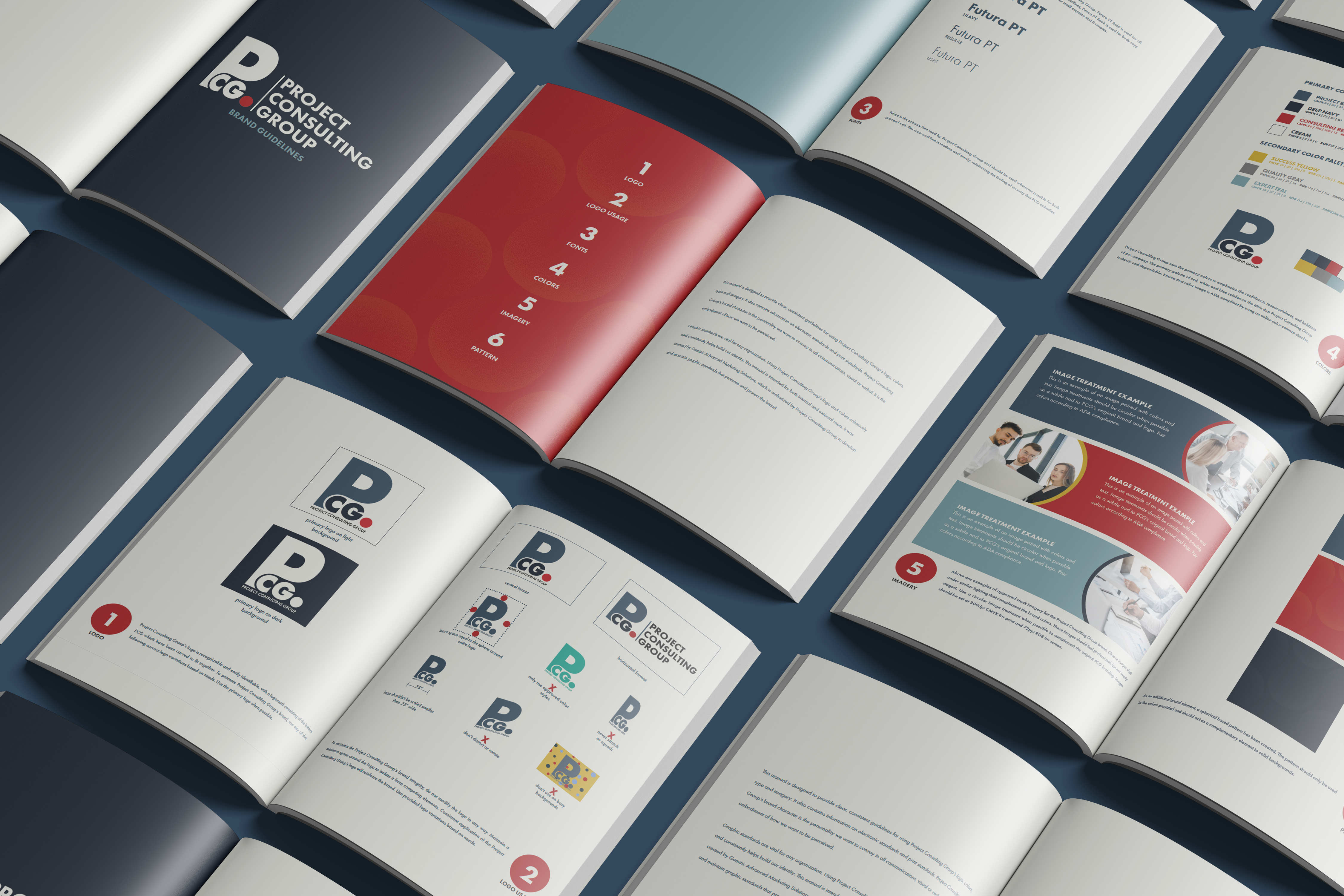
Brand Guidelines Document
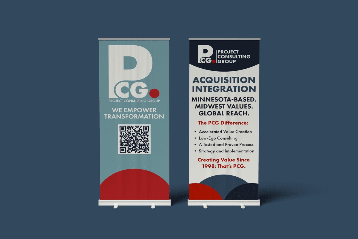
Roll Up Banners
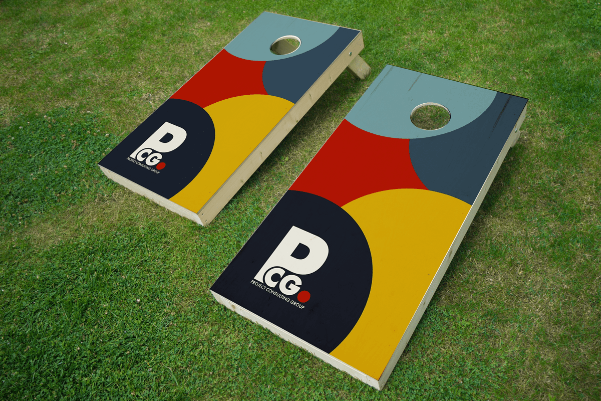
Corn Hole Boards
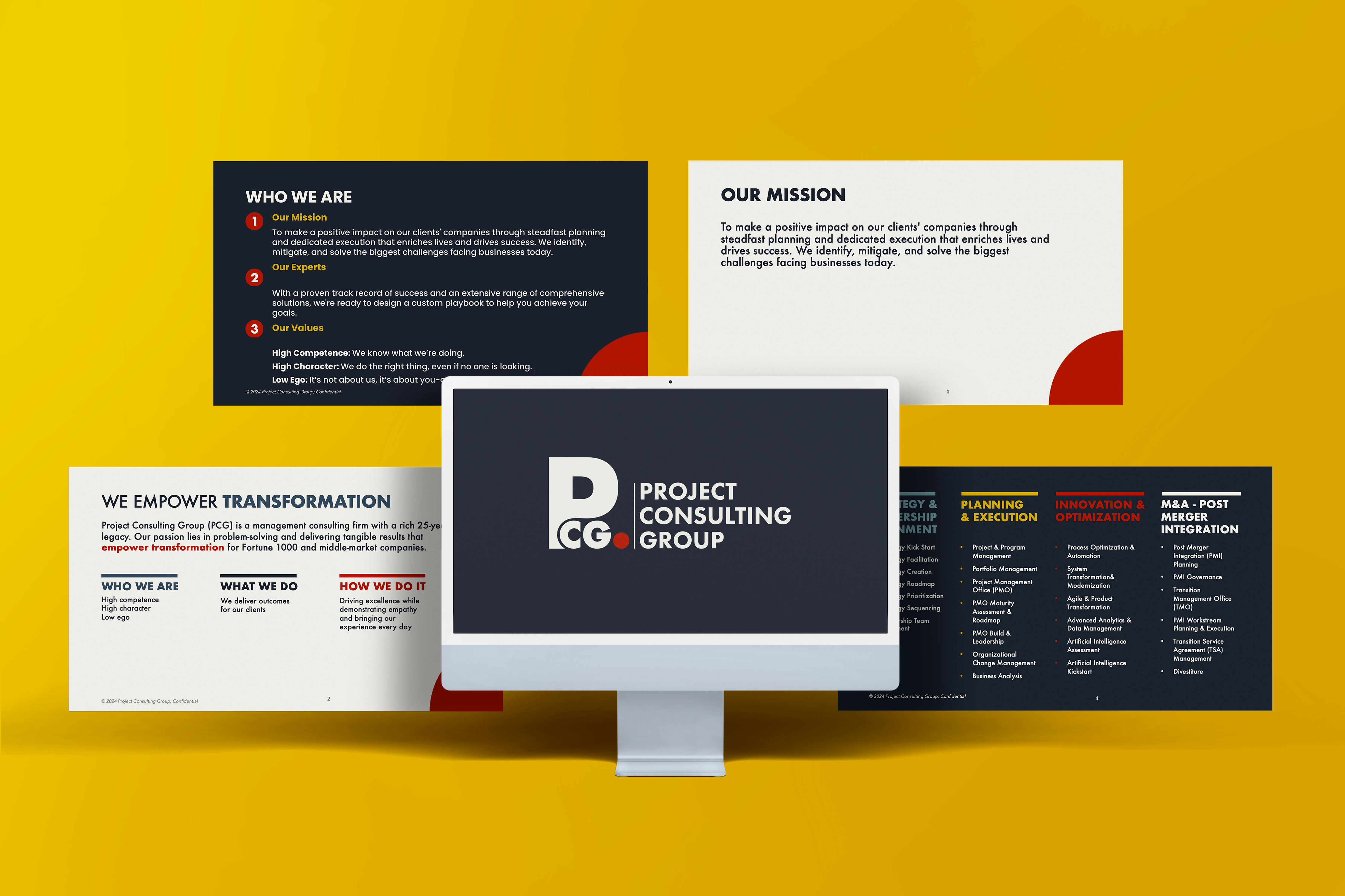
Master Presentation Deck
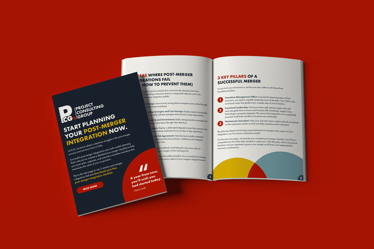
LinkedIn Document Ad / Brochure
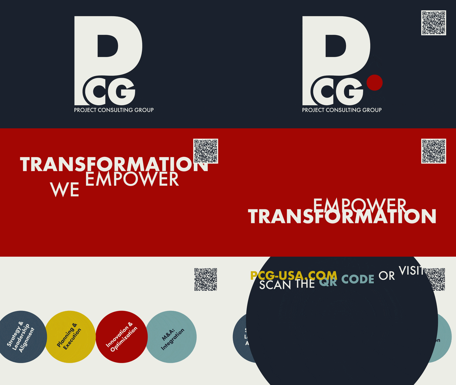
Animated Event Ad
Please note that while all designs shown were created by me, this project was completed in association with and credited to Gemini Agency.