

GeMini agency
Project Overview
I led a comprehensive brand overhaul for Gemini Agency, transforming a fragmented identity into a cohesive, scalable system built for consistency across all touchpoints. The project began with competitive and internal audits, progressed through strategic alignment and system development, and expanded into a full rollout across digital, print, and marketing assets. The final outcome modernized the brand while preserving key equity elements, including a refined evolution of the original logo mark.
Sole & Lead Designer
Role
Brand System & Website
Project Type
8 Months
Timeline
The Client Challenge
Gemini Agency required a comprehensive brand overhaul to remain competitive within an increasingly saturated market. Although the company had undergone a rebrand only five years earlier, inconsistent execution and the involvement of multiple stakeholders over time had caused the identity system to become fragmented and diluted across touch points. As a result, the brand lacked cohesion, clarity, and consistency in both internal and external communications.
The Creative Strategy
This project followed a structured, strategy-led design process in phases, focused on transforming an inconsistent brand into a cohesive and scalable identity system. It began with competitive analysis and stakeholder alignment to define clear positioning opportunities, followed by the development of a flexible brand foundation including typography, color, and visual language. From there, the system was expanded across digital and print touchpoints and ultimately refined into a modernized identity that preserved key brand equity while improving clarity, consistency, and long-term usability.
Brand Audit
As the acting Creative Services Manager for the client, Phase 1 of the process differed slightly from a traditional discovery phase. I developed a strategic presentation analyzing the brand positioning and visual systems of the client’s top three competitors, identifying key areas where the existing brand was underperforming or lacking differentiation within the market. The audit ultimately revealed the following:
Stakeholder Discovery
To align internal stakeholders on a clear direction for the brand, I set a meeting to discuss the future of the brand and what a successful project should look like. This helped guide a focused discussion around the future of the brand, grounded in both visual direction and business objectives, and was supported by a set of key guiding questions used throughout the conversation:
Mood Boarding
After discovery, the team was in agreement that the updated system should feel modern, powerful, and bold. To align internal stakeholders on a clear direction for the brand, I developed a series of three mood boards that explored varying levels of brand evolution, ranging from a light refinement of the existing identity focused on improving consistency and visual clarity, to a more substantial repositioning, and ultimately a full rebrand of the agency. After presenting, the team decided to move forward with a full rebrand which included the following:
Brand Guidelines
The client requested that any updates to the logo be deferred until the broader brand system had been fully developed. In response, I created a comprehensive brand guidelines document to ensure all applications were intentional, consistent, and properly structured as the system evolved. This document outlined detailed specifications for logo usage (to be finalized in a later phase), color systems with exact values and accessibility-compliant contrast standards, a defined typographic hierarchy, and clear direction for photography style, composition, and post-production treatment. It also included an extensive library of branded assets, including system icons and custom illustrations, designed to support a cohesive and scalable visual language across all brand touch points.
Website Redesign
At the time of this project, the team included a dedicated full-stack web developer and UI/UX, which allowed for a more integrated and flexible design-to-development workflow. Rather than designing directly in industry-standard UI tools like Figma or Adobe XD, I chose to begin the process in Adobe Illustrator, designing each page in a fully crafted, layout-driven format. This approach allowed for a more seamless translation of design elements into other brand applications. Once the visual direction was finalized, the designs were transitioned into Adobe XD for structure, handoff, and collaboration with development. While I recognize that tools like Figma and XD are the industry standard for web design workflows, this Illustrator-first approach provided a more unified foundation for extending the brand system across digital and physical touch points. Below is an overview of how this process was executed:
After development was completed, the team completed a thorough QA for both prelaunch and postlaunch.
Brand Assets Updates
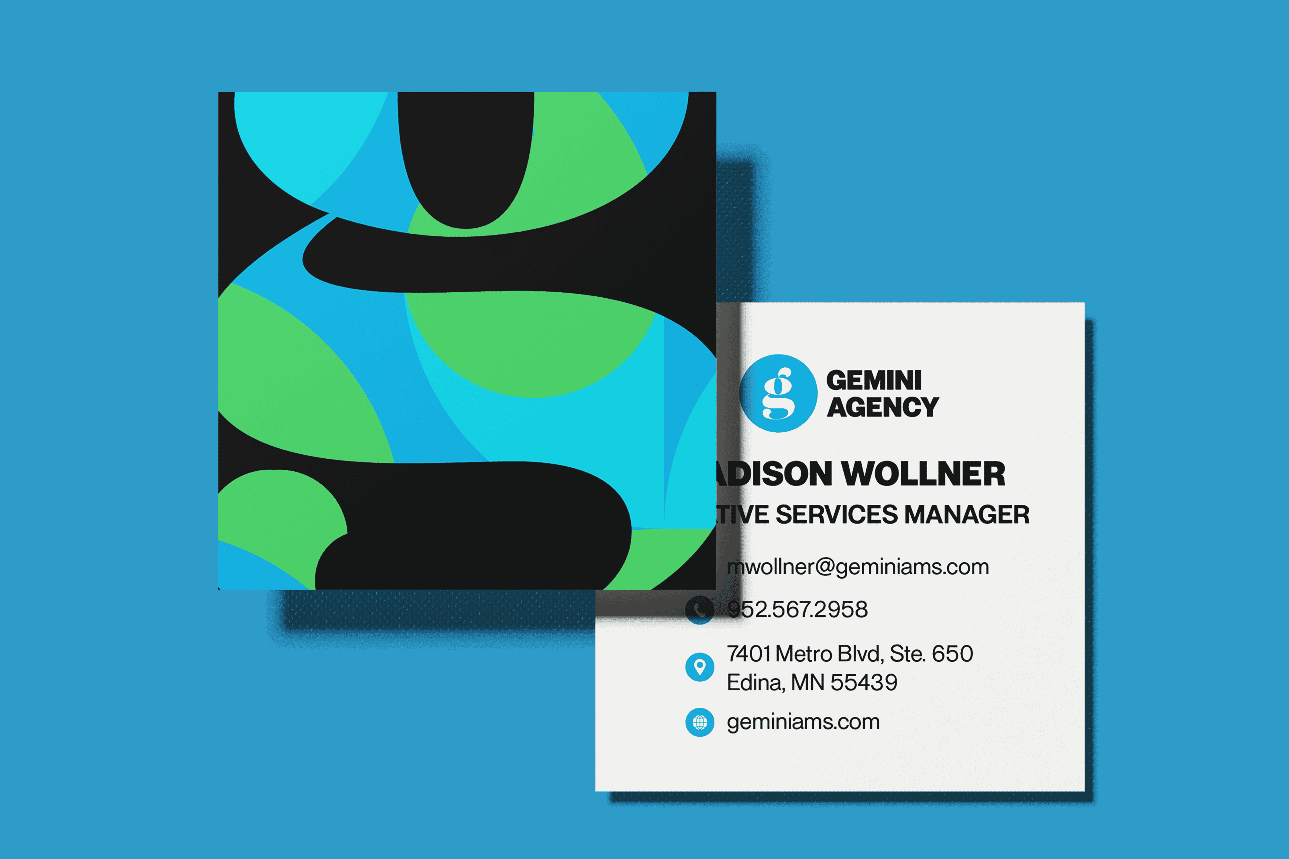
Once the website was launched, the focus shifted toward expanding and standardizing the remaining brand assets to ensure consistency across all touchpoints. Using the newly established brand guidelines and website as the primary reference point, I systematically updated and refined a range of materials to align with the evolved identity system.
After development was completed, the team completed a thorough QApre-launch, launch, and post-launch.
Final Logo Deliverable
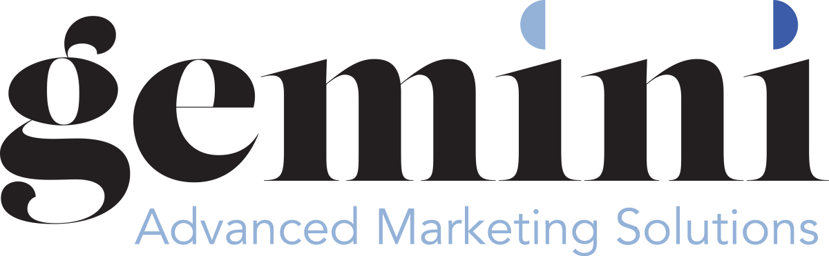
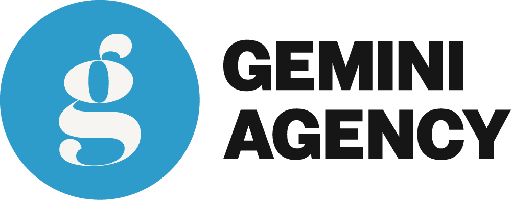
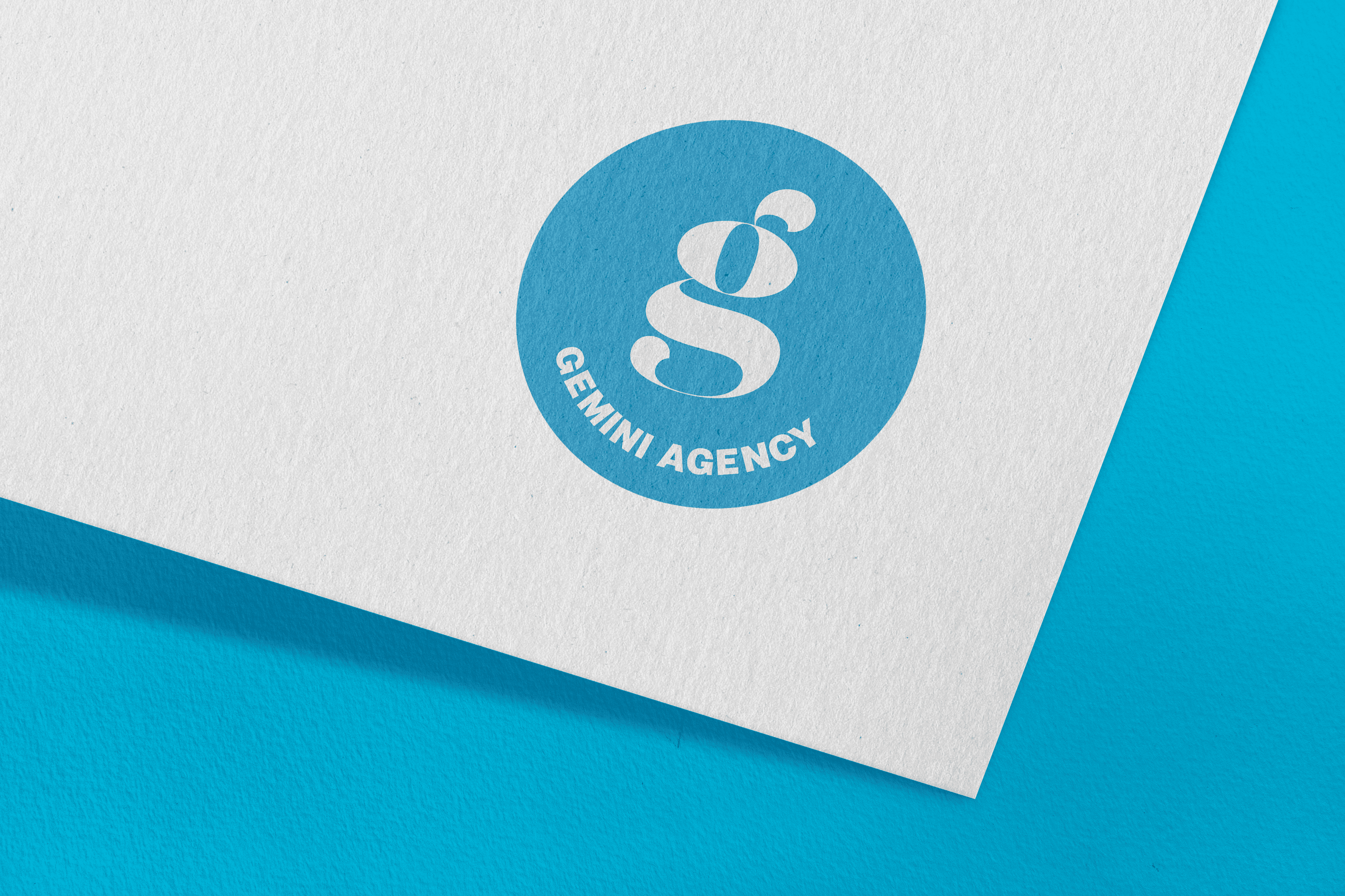
Once the broader brand system had been fully refined and implemented, the client felt confident moving forward with a logo update that better aligned with the evolved identity. A key requirement was the preservation of the original “G” lettermark, which held strong recognition and equity within the existing brand. Since the original typeface used for the mark was no longer part of the updated typographic system, I recontextualized it by enclosing the letterform within a circular container. This approach allowed the mark to integrate more seamlessly with the new visual language while maintaining continuity with the original identity. The result balanced heritage and modernity, preserving brand recognition while ensuring visual consistency within the refreshed system.
Logo Before & After
Project Mockups
Logo Design
Business Cards
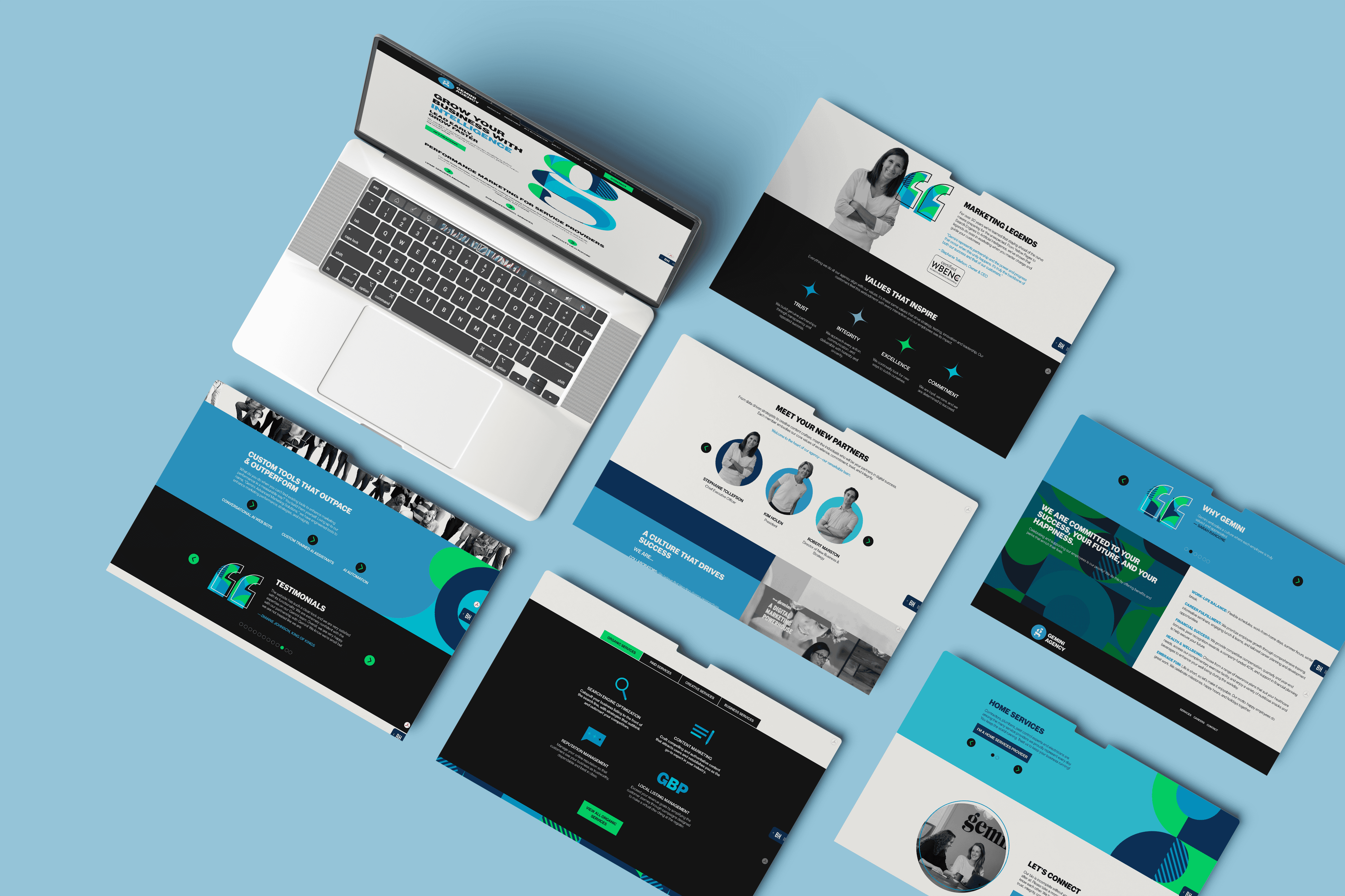
Website Redesign
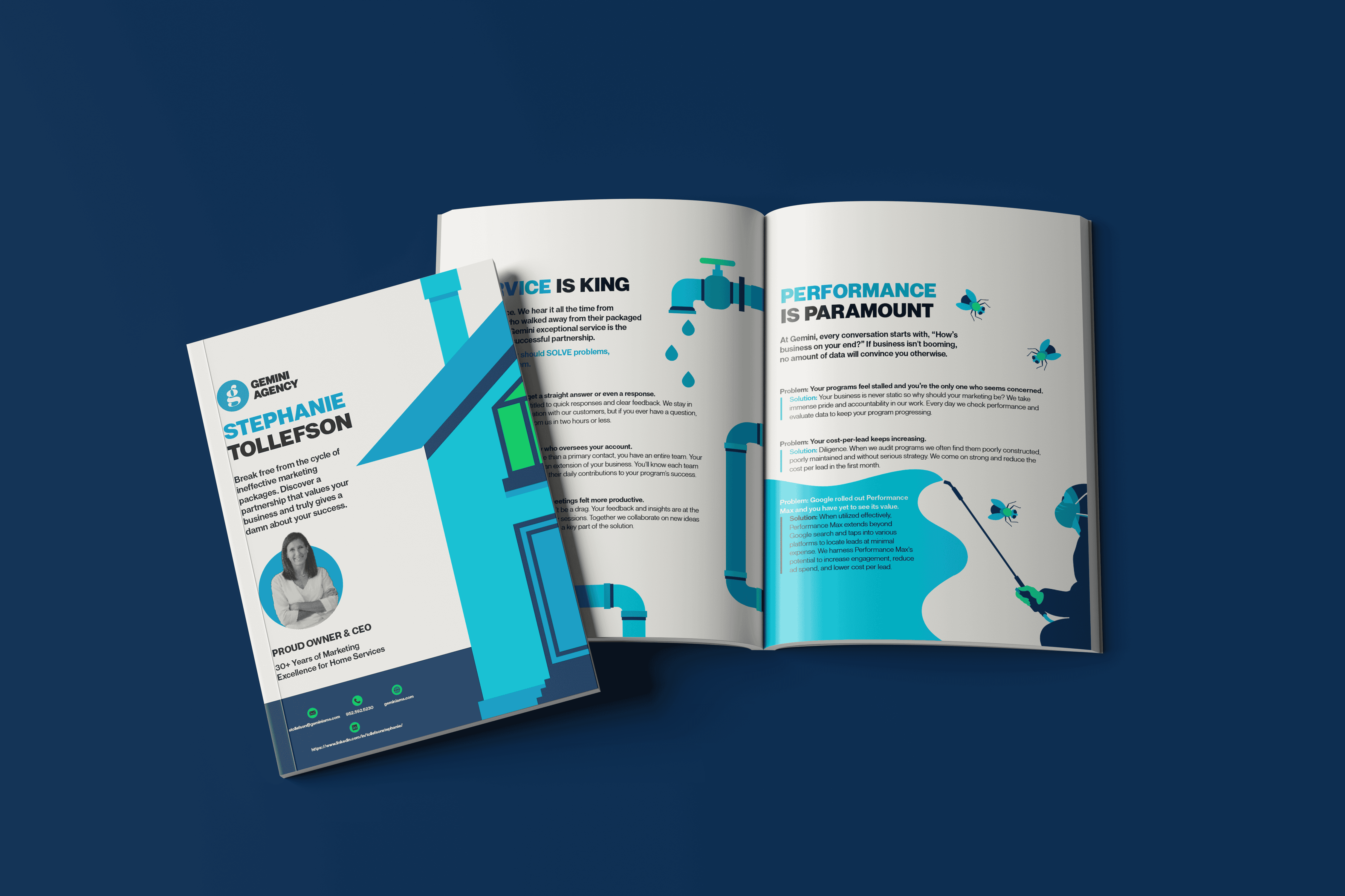
Catalog
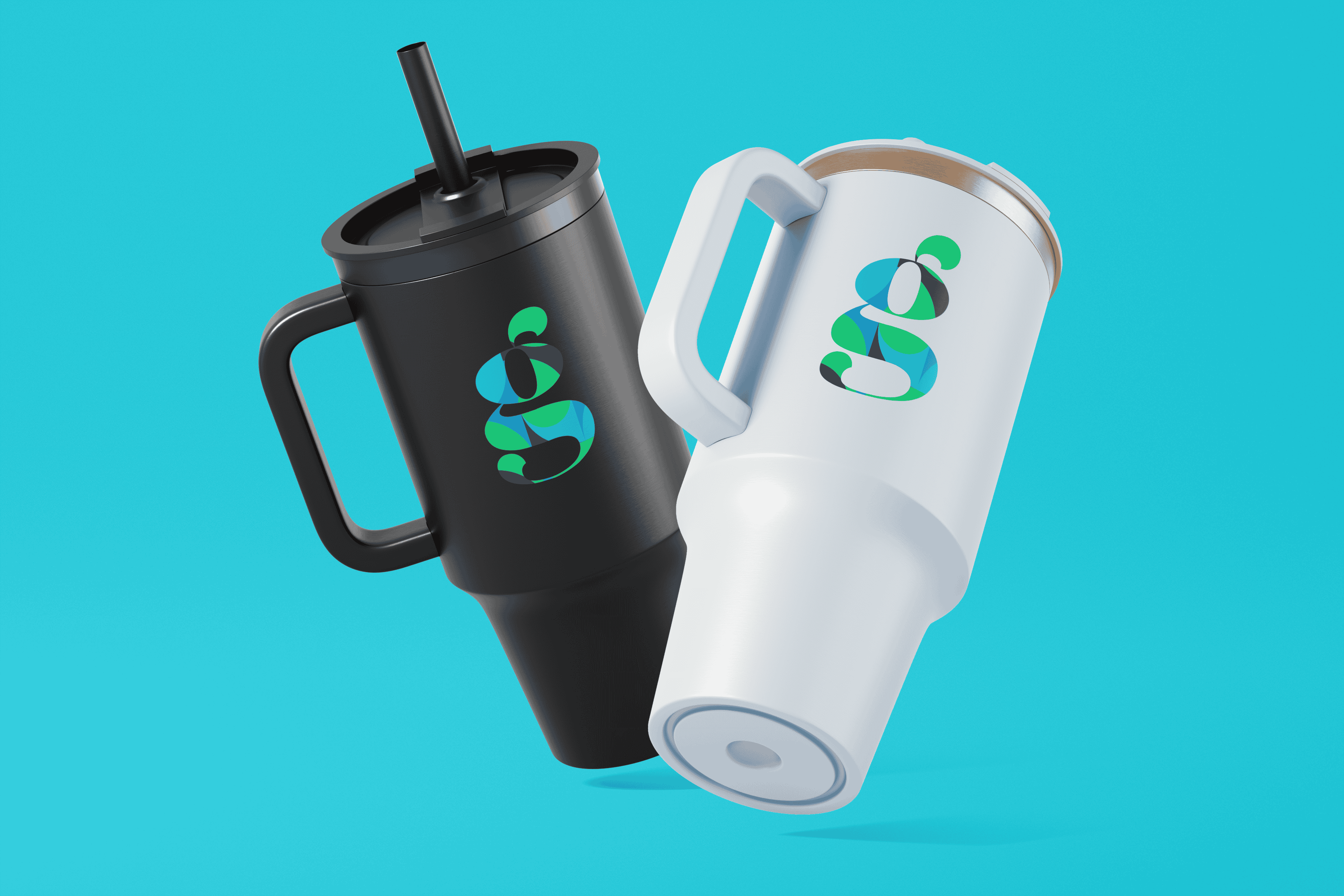
Tumblers
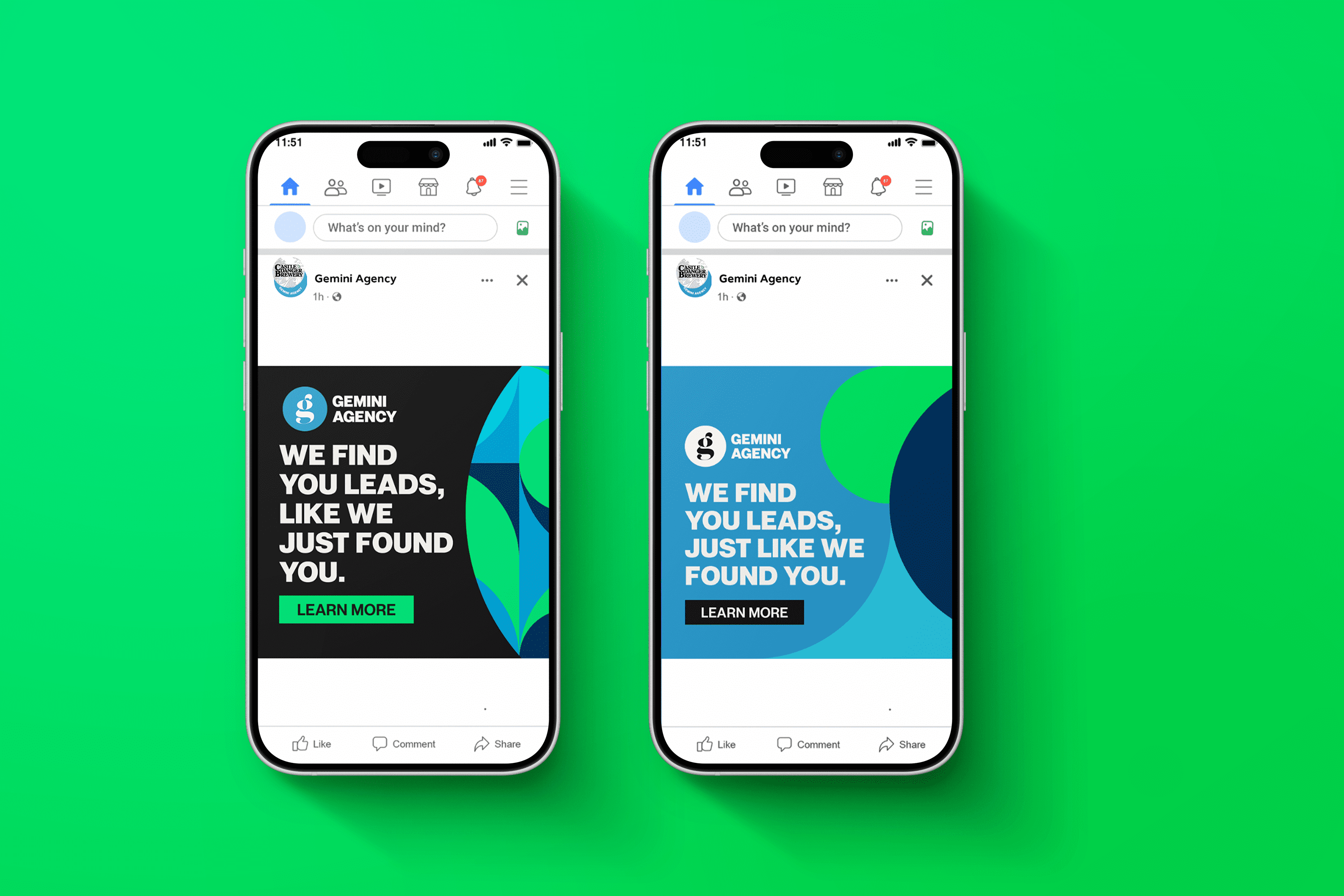
Meta Ads
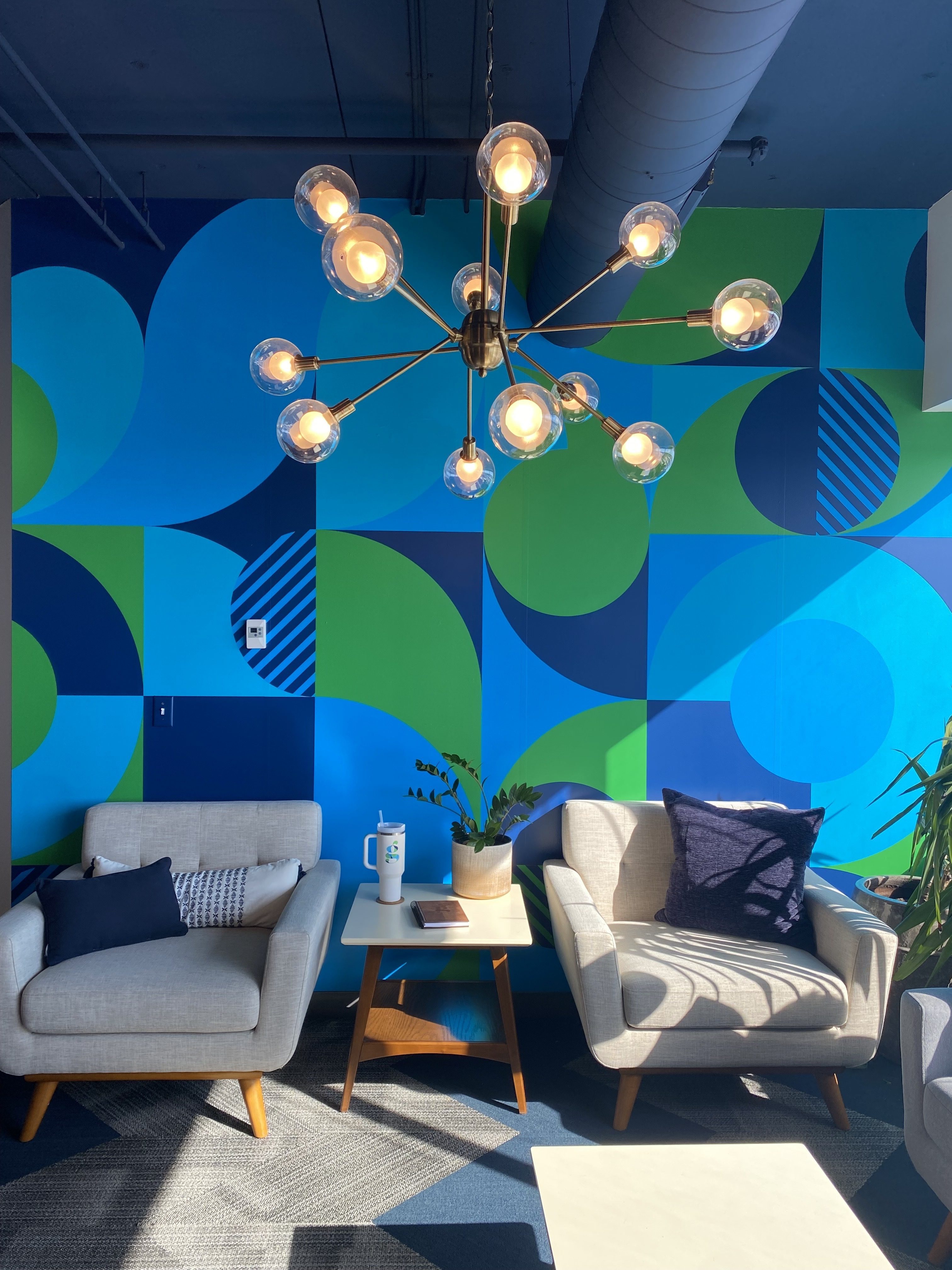
Office Wall Wrap
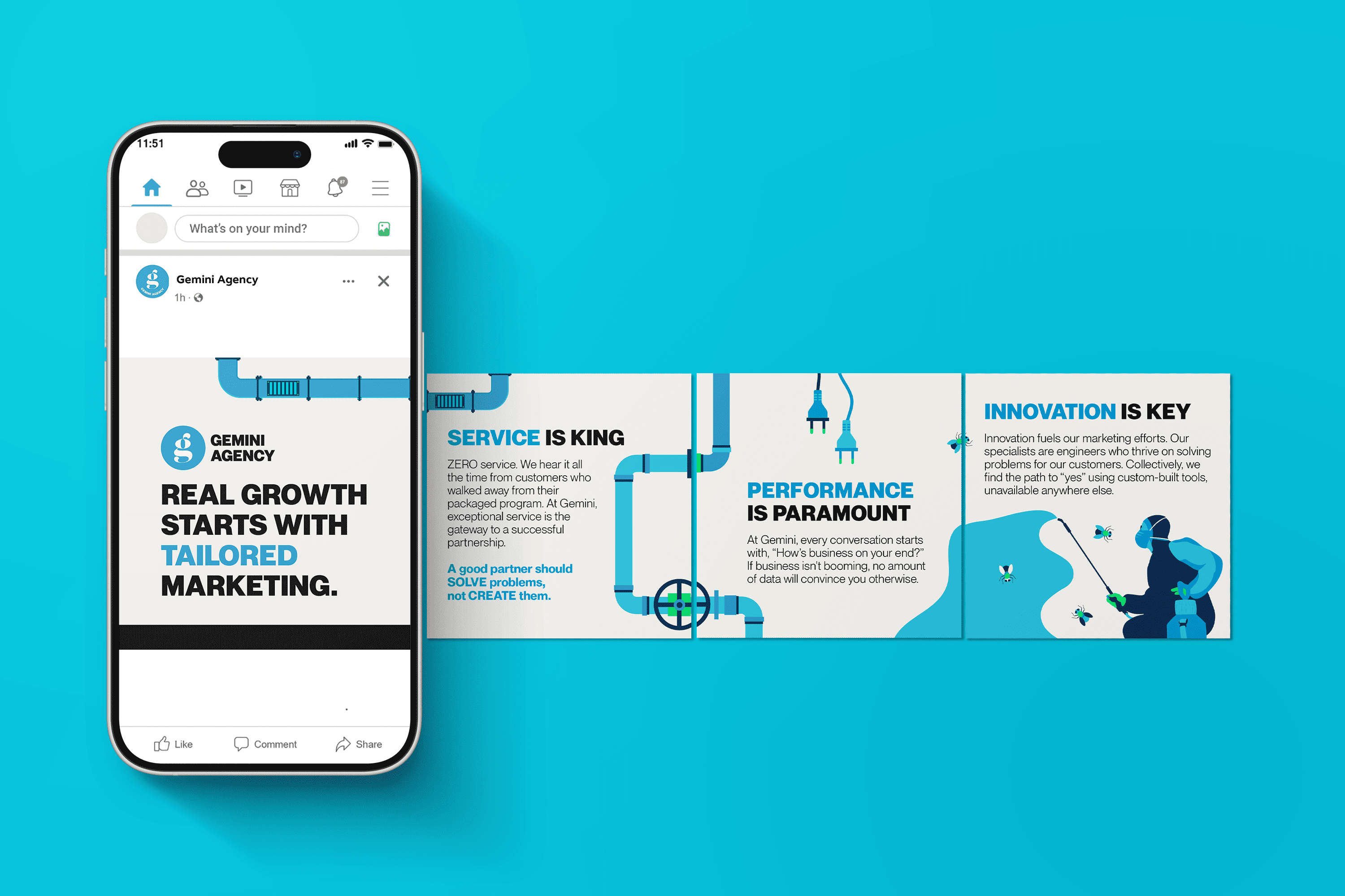
Meta Ads
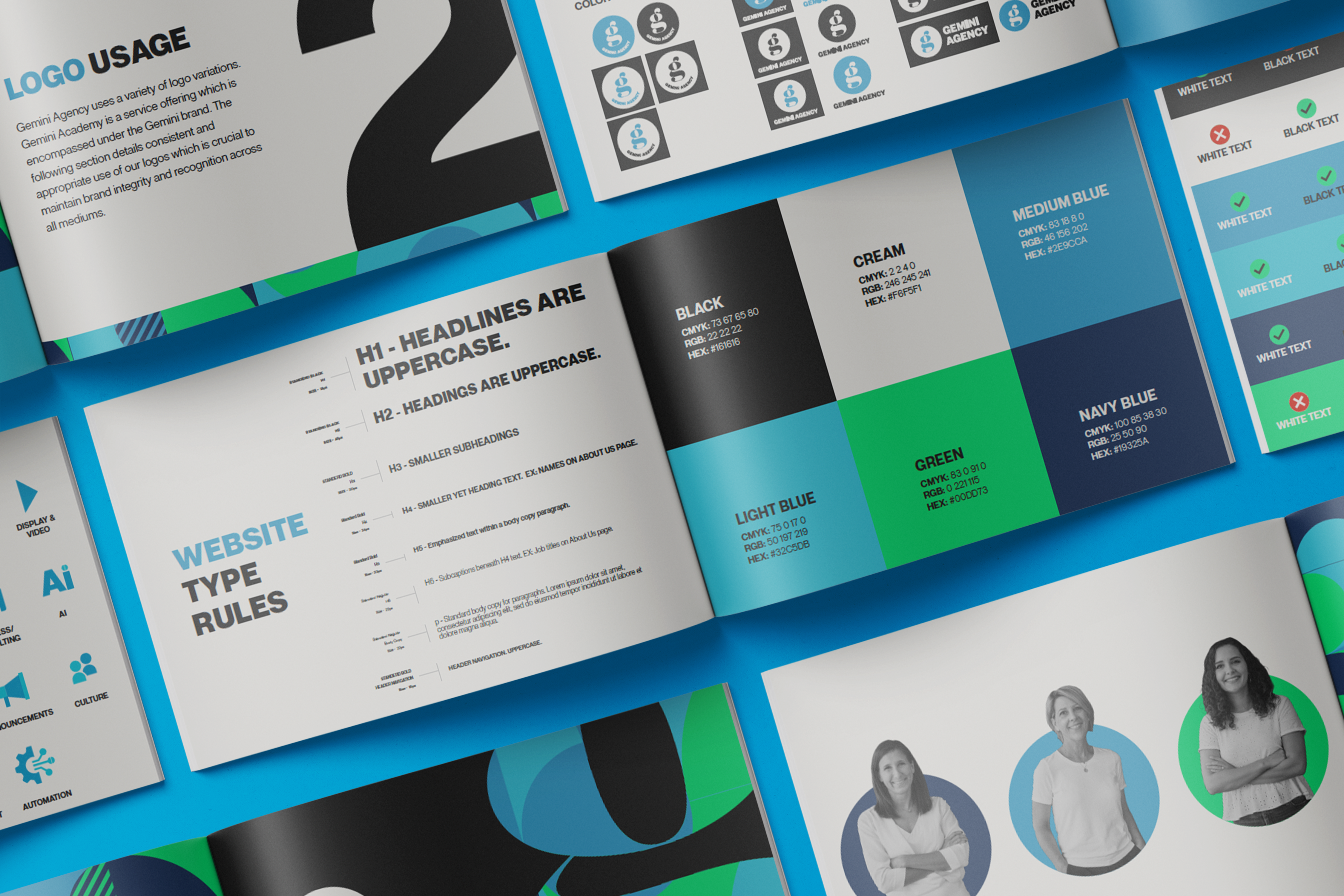
Brand Guidelines Document
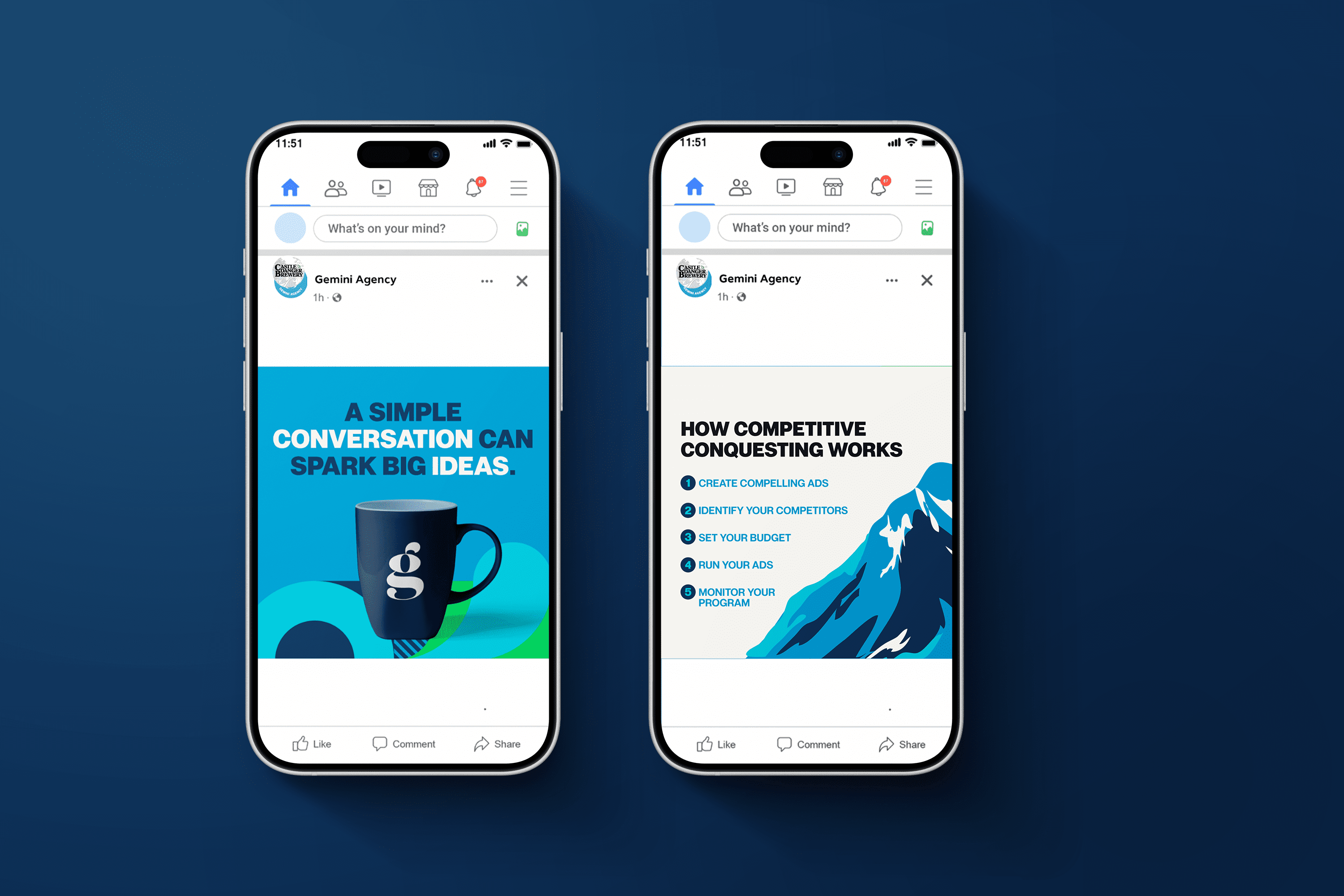
Meta Posts
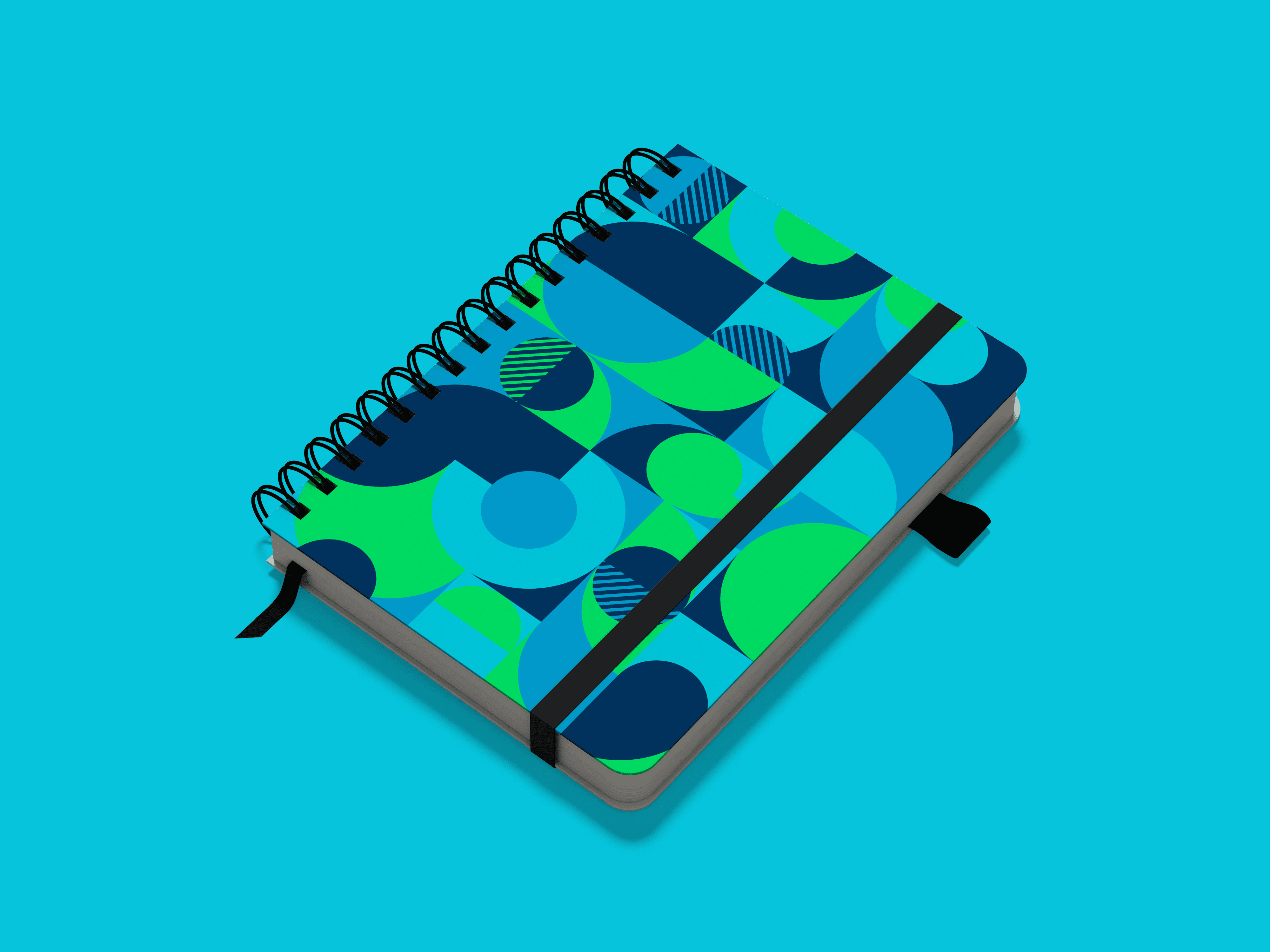
Notebook
Meta Ads

SWAG Giveaway
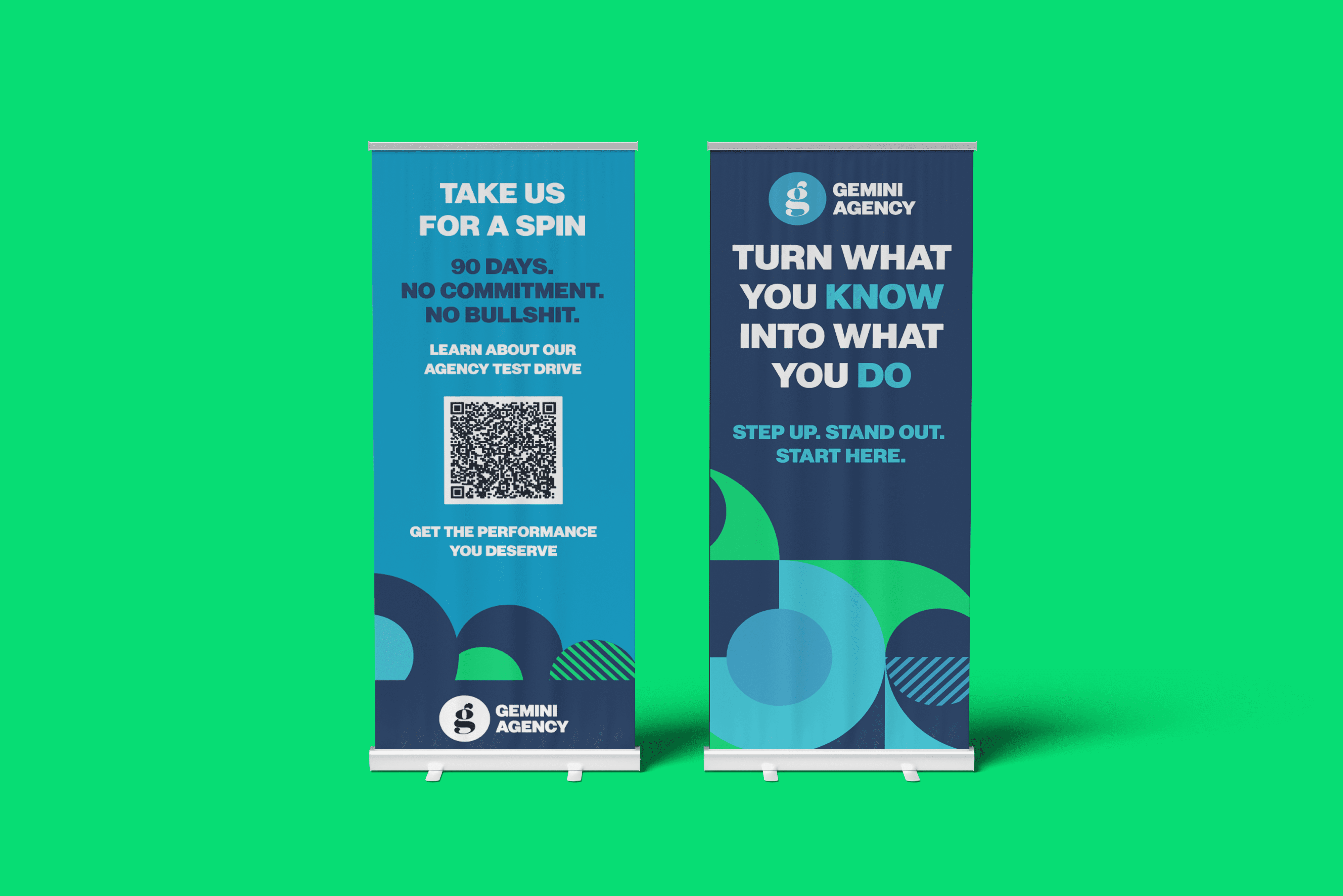
Roll Up Banners
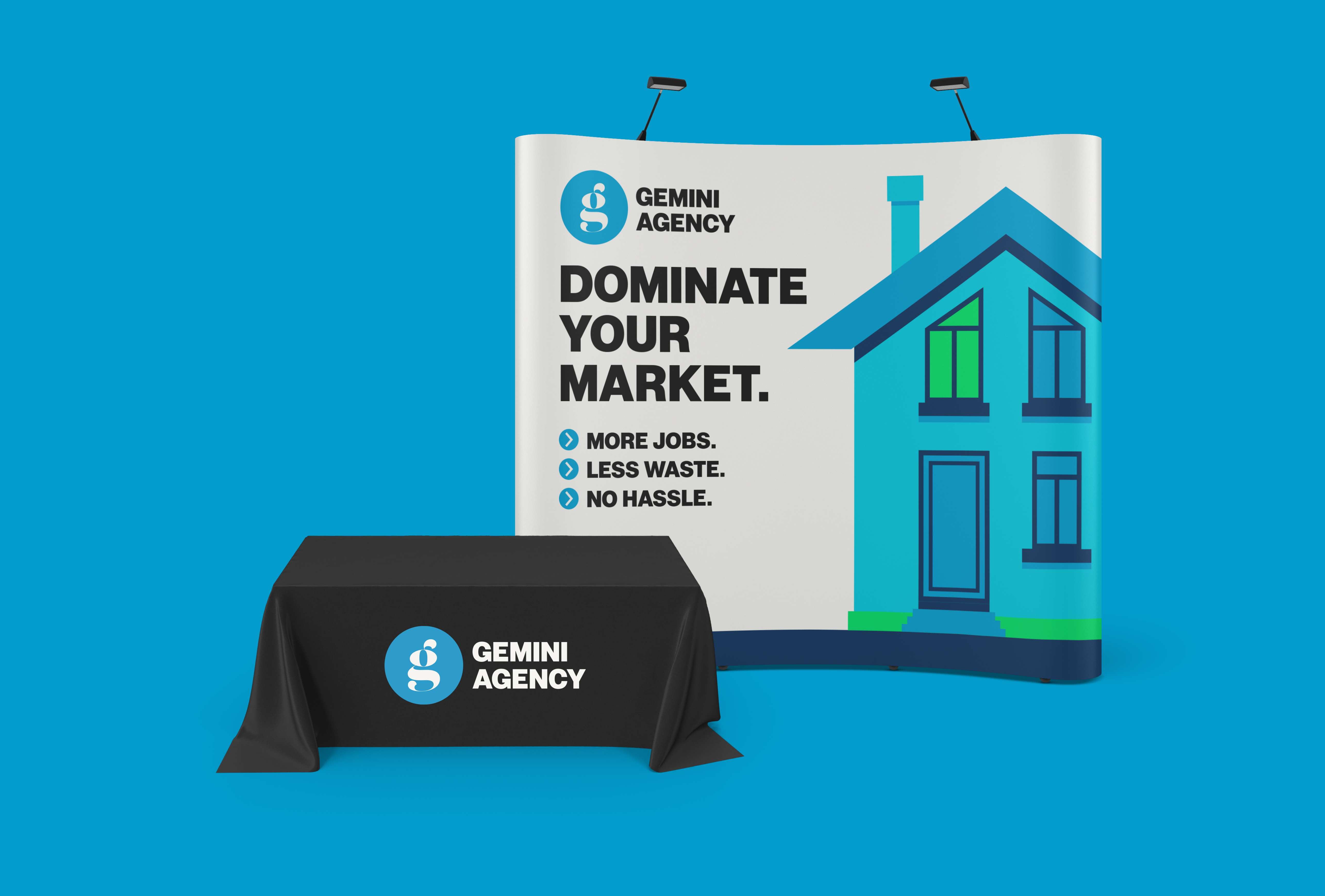
Trade Show Exhibit
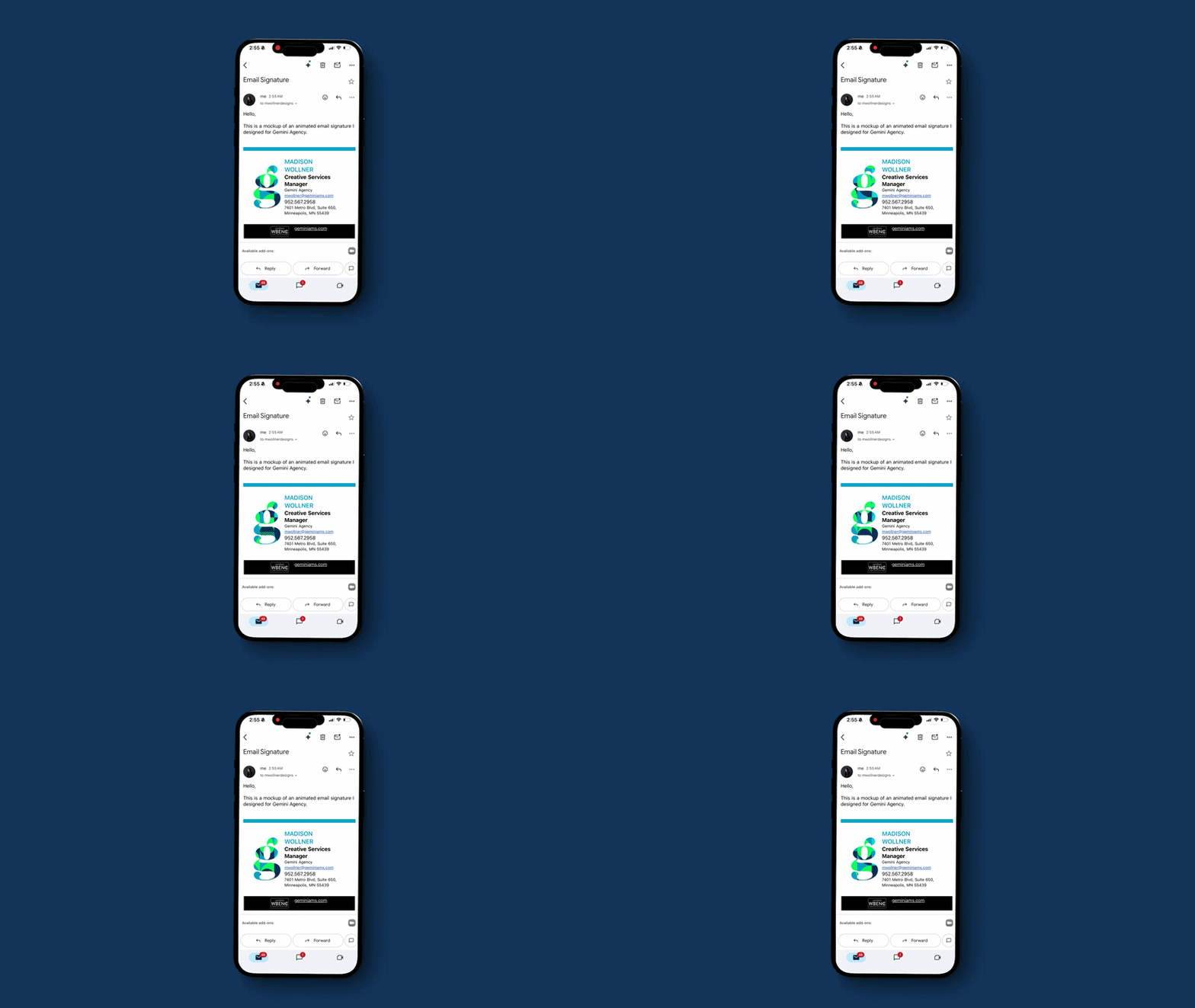
Animated Email Signature
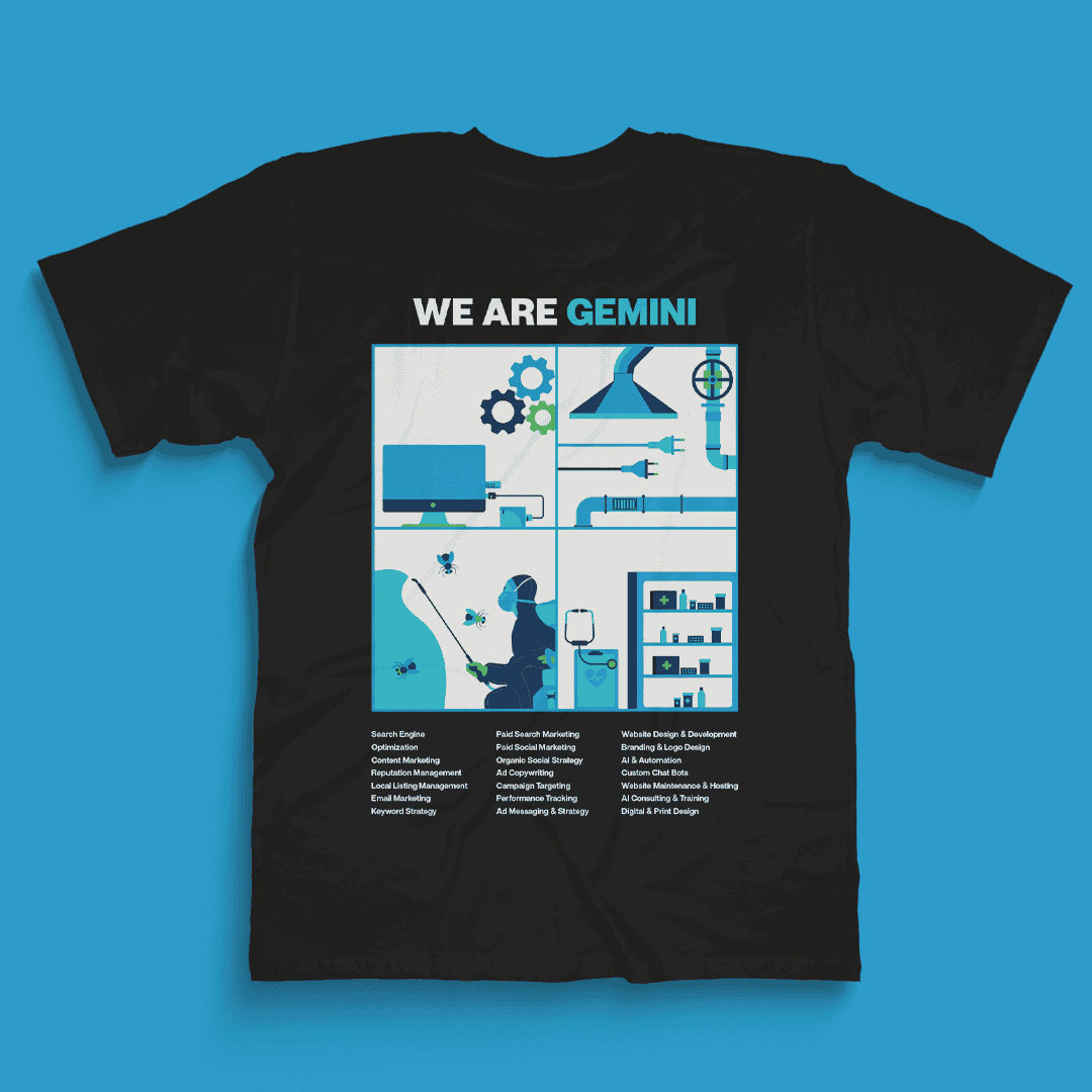
Company T-shirt
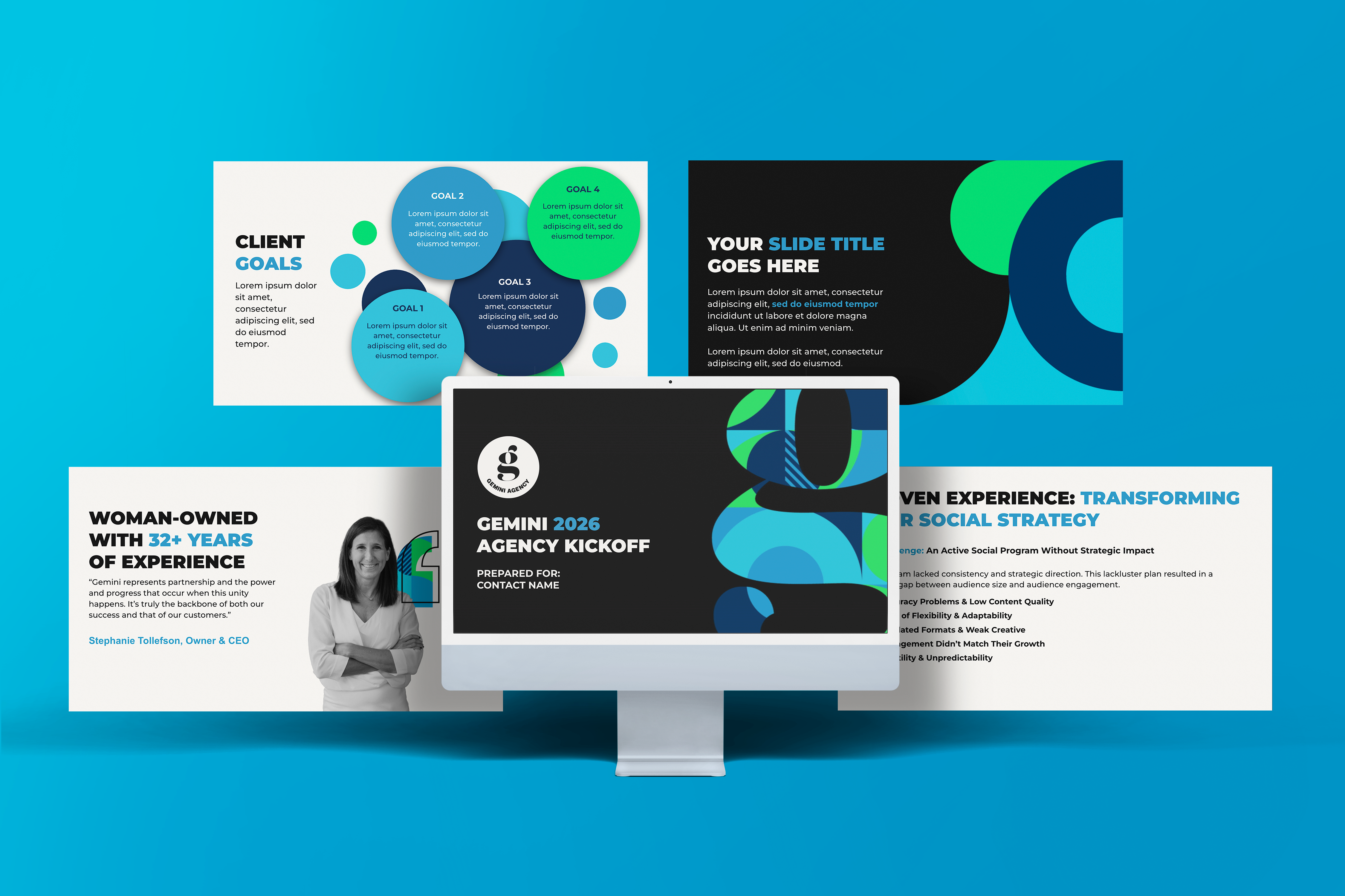
Master Presentation Deck

Logo Animation
Please note that while all designs shown were created by me, this project was completed in association with and credited to Gemini Agency.