

CUMMINGS KEEGAN
Project Overview
With a new head partner in place, Cummings Keegan identified an opportunity to modernize their brand identity and move toward a more simplified, contemporary direction. The original logo, which had been in use for over 30 years, felt dated and lacked the scalability needed for modern applications. The goal was to preserve the core equity of the existing identity while refining it into a more polished and updated system.
Sole & Lead Designer
Role
Brand System
Project Type
3 Months
Timeline
The Client Challenge
The client faced the challenge of modernizing their brand without losing the core identity that defined who they are. They needed to feel current and competitive in the market while remaining recognizable and true to their established presence. They also needed the brand system to be widely accessible and simple to use. With multiple stakeholders involved in the decision-making process, aligning on a direction that resonated across a broad group added a layer of complexity to the project.
The Creative Strategy
I focused on identifying the core elements that had established recognition over the past two decades and separating them from the aspects that had become outdated or limiting. This approach allowed me to retain the brand’s strongest equity while introducing a more flexible identity system, refined visual language, and improved consistency across digital, print, and partnership applications.
Stakeholder Discovery
Since the client had already articulated clear challenges, the project began directly within a focused discovery phase rather than a traditional audit. Early conversations explored both immediate needs and long-term business objectives, helping surface key strategic considerations that shaped the direction of the work and informed the questions that followed:
Mood Boarding
After initial discovery, the team aligned on a clearer vision for a brand that felt more modern and polished. To help guide decision-making, I developed three distinct creative routes, ranging from a subtle refinement of the existing identity to a more strategic evolution and ultimately a complete rebrand. After evaluating each direction, the team selected the strategic refresh path, which included the following:
Brand Guidelines & Logo
From the selected direction, I developed a comprehensive brand system aimed at ensuring consistency and scalability across all applications. This involved establishing practical rules for how the identity should be applied, along with defining standards for logo usage, color, typography, and photography. By structuring these decisions into a clear system early on, the guidelines created a reliable framework for cohesive execution across all assets.
Brand Assets Updates
With the brand guidelines finalized, the next phase focused on applying the updated identity system across the organization’s remaining materials. Using the newly established standards as a foundation, I reviewed, updated, and unified a wide range of digital and print assets to ensure consistent execution of the refreshed brand across every touch point.
Logo Before & After

Project Mockups
Logo Design
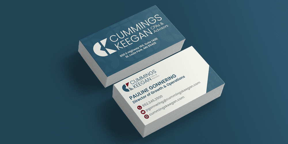
Business Cards
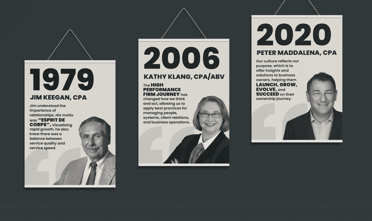
Leadership Posters
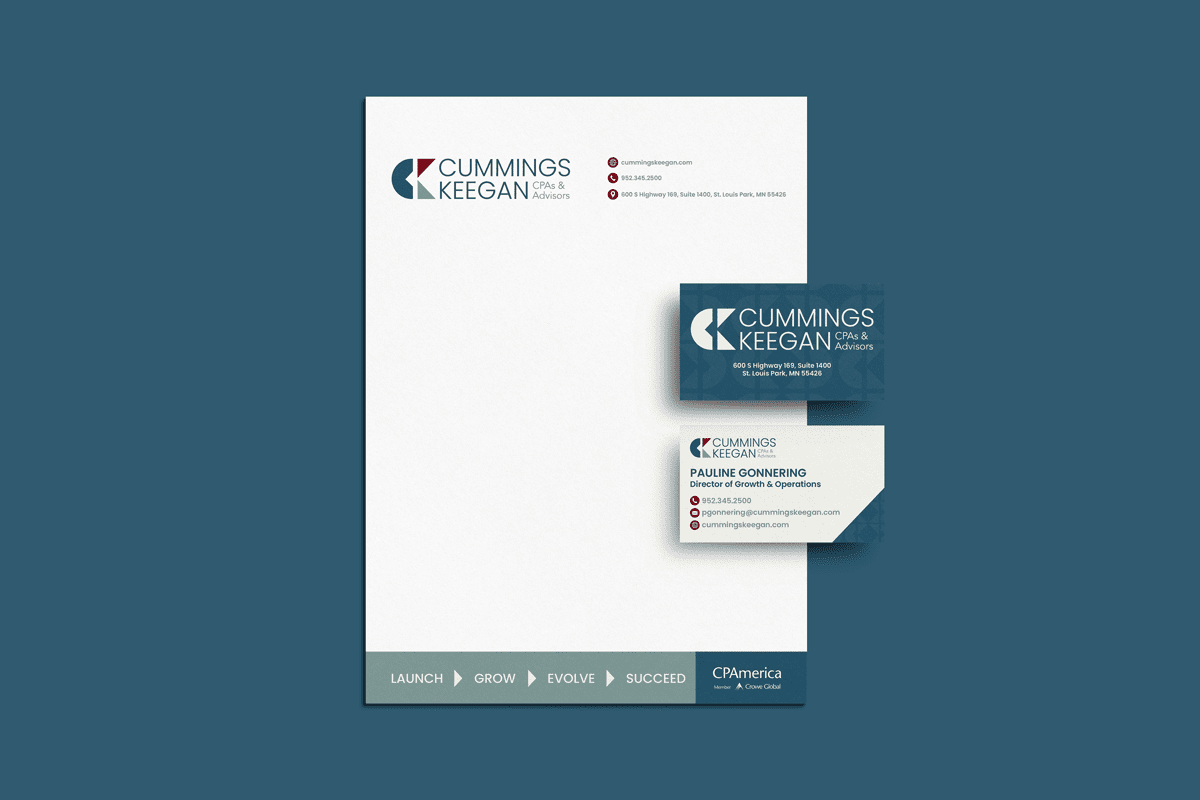
Letterhead
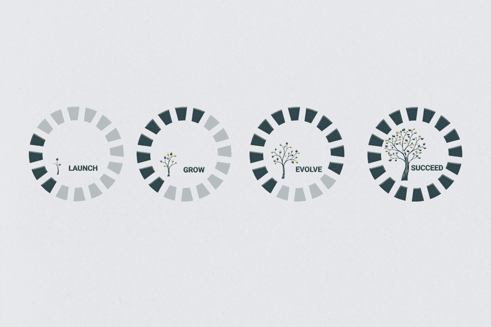
Values Wall Graphic
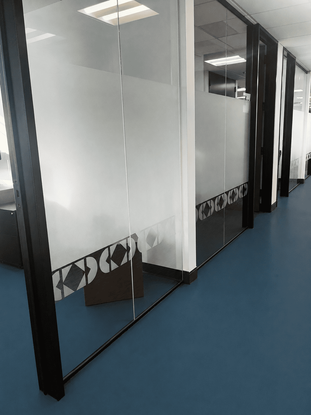
Glass Film
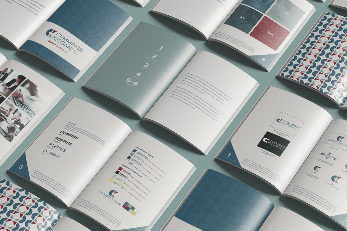
Brand Guidelines Document
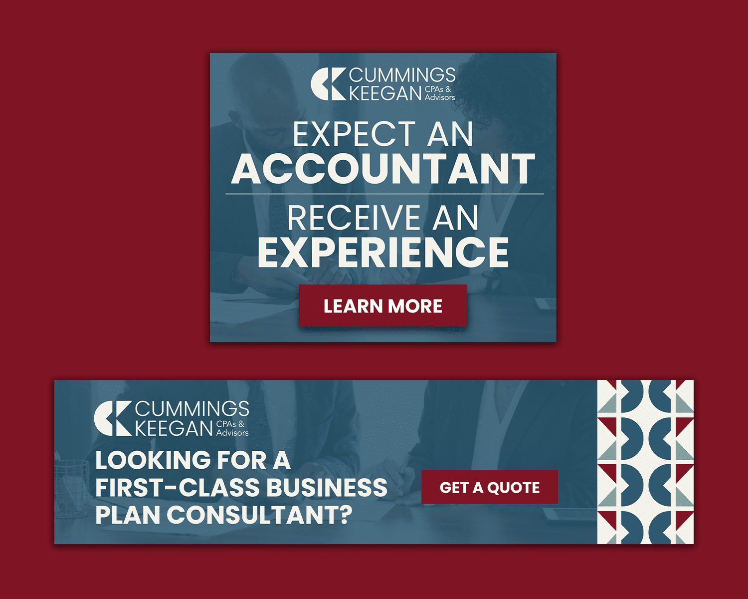
Display Ads
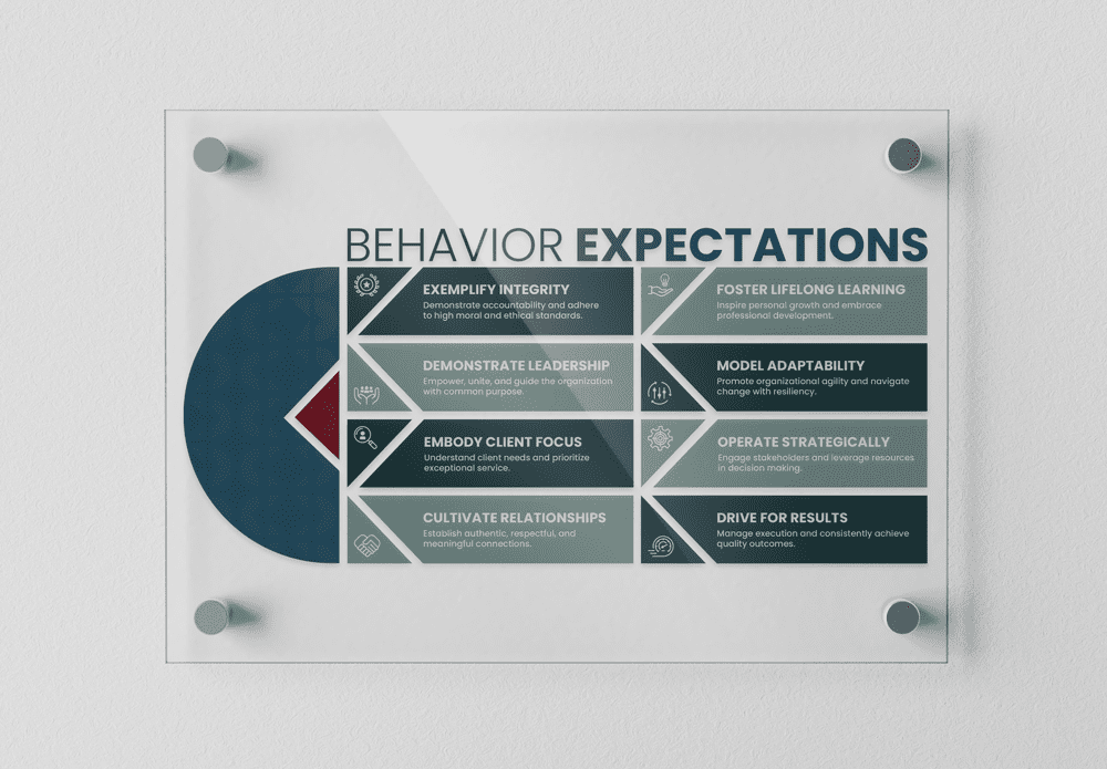
Expectations Wall Graphic

Logo Wall Graphic
Please note that while all designs shown were created by me, this project was completed in association with and credited to Gemini Agency.